Introduction to Scandi-British Fusion
In recent years, UK interiors have witnessed a delightful evolution: the rise of the Scandi-British fusion. This style artfully marries the pared-back simplicity of Scandinavian minimalism with the inviting warmth and character so typical of British homes. The result is an aesthetic that feels both serene and lived-in—a balance that appeals to many in today’s fast-paced world. With its focus on clean lines, functional beauty, and thoughtfully chosen colour palettes, this hybrid trend brings together the best of both cultures. It speaks to those who crave order and calm, yet still want their spaces to feel welcoming and personal. As we explore this trend further, you’ll see how it draws from cool Nordic tones while layering in rich, comforting accents inspired by classic British cosiness—a true reflection of modern living in the UK.
2. The Role of Colour in Shaping Atmosphere
Colour is far more than a decorative afterthought; it’s the quiet architect behind every room’s mood and comfort. In the context of Scandi-British fusion, understanding how colour can shape atmosphere becomes especially vital. Scandinavian design is renowned for its love of light and space, using cool tones to echo snowy landscapes and maximise natural daylight. Think soft greys, pale blues, and whisper-light whites that lend a sense of calm and freshness even on the dullest winter afternoon.
Meanwhile, British homes—often older with smaller windows—lean towards warmer, cosier hues to counterbalance grey skies and chilly weather. Rich moss greens, muted ochres, and earthy taupes cocoon living spaces with a sense of tradition and understated comfort. This blending of cool Scandinavian palettes with British warmth forms the heart of Scandi-British fusion interiors: an environment that feels both tranquil and inviting.
Comparing Colour Effects: Scandinavian vs. British Perspectives
| Aspect | Scandinavian Influence | British Influence |
|---|---|---|
| Mood Creation | Cool tones promote serenity and clarity, making rooms feel open and uncluttered. | Warm accents foster snugness and familiarity, perfect for reading corners or cosy evenings in. |
| Comfort Factor | Light palettes reflect precious sunlight, enhancing brightness and lifting spirits during long winters. | Darker shades absorb light, offering a sense of enclosure ideal for winding down after a busy day. |
| Cultural Reflections | Simplicity aligns with ‘lagom’—the Swedish notion of balance. | Layered colours echo the eclectic charm found in traditional British homes. |
The Emotional Impact of Colour Choices
Choosing the right colour scheme is about tuning into how you want your home to feel. A palette dominated by cool Scandinavian hues gives an immediate impression of order and peace—a practical solution if you crave more calm in your daily routine. Introduce British-inspired accents like warm terracotta or deep navy in accessories or feature walls, and you add depth without sacrificing simplicity. The result? A balanced home atmosphere that encourages both relaxation and connection—a true reflection of modern British life infused with Nordic sensibility.

3. Cool and Calm: Foundations of the Scandi Palette
When it comes to Scandi-British fusion interiors, the palette often begins with a whisper rather than a shout. Classic Scandinavian colours are celebrated for their subtlety—soft greys, icy blues, and muted whites form the backbone of this aesthetic. These hues echo the serene landscapes of the Nordic countries, where daylight is precious and interiors are designed to maximise calm and clarity. Imagine walking into a living room painted in gentle cloud-grey, accented by plush throws in pale blue or off-white. The effect is fresh, bright, and effortlessly relaxed—a perfect antidote to Britain’s sometimes gloomy skies.
What makes these cool tones so appealing is their versatility. Soft greys work beautifully as an all-over colour, providing a blank canvas that feels anything but cold when layered with natural textures like wool or linen. Icy blues offer a hint of colour without overwhelming the senses, reminiscent of frosty mornings or the distant North Sea. Muted whites—never stark—bring light into shadowy corners, making even the smallest flat feel more spacious and airy.
This understated approach is both practical and inviting for British homes, which often have unique architectural quirks and varied natural light. By choosing classic Scandi shades as your foundation, you create a space that’s at once organised and soothing—ideal for unwinding after a busy day in the city or cosying up with a cuppa on a rainy afternoon. In essence, these cool and calm colours lay the groundwork for a home that feels truly lived-in yet always looks put together.
4. Warmth and Heritage: British Accents and Hues
While Scandi style is known for its understated coolness, the British touch brings in a comforting sense of heritage through colour. In the Scandi-British fusion palette, traditional British shades such as rich mustards, clay reds, and forest greens play a pivotal role. These hues not only evoke memories of country houses, autumn walks, and classic British interiors but also introduce warmth and depth to what could otherwise feel like a too-minimal space.
The Role of Heritage Colours
These quintessentially British colours act as anchors amidst pale woods and soft greys. A splash of mustard in a velvet cushion or a painted feature wall can instantly brighten up the room, making it feel more inviting and lived-in. Clay red works beautifully on decorative ceramics or even a reading nook chair, echoing the rustic charm of English cottages. Forest green—whether on cabinetry or in statement accessories—brings the lushness of the countryside indoors, fostering a sense of calm and connection with nature.
Popular British Accent Shades
| Colour | Description | Typical Use |
|---|---|---|
| Mustard Yellow | Deep, golden-yellow reminiscent of classic British kitchens and textiles | Cushions, throws, lampshades |
| Clay Red | Earthy red with terracotta undertones | Ceramics, feature walls, armchairs |
| Forest Green | Rich green inspired by British woodlands | Kitchens, plant pots, rugs |
| Oxford Blue | Traditional deep blue named after Oxford’s historic colleges | Accent walls, bedding, artwork frames |
| Pewter Grey | Soft grey with subtle warmth, often used in period homes | Furniture finishes, window frames, doors |
Balancing Heritage with Modernity
The key to successful Scandi-British fusion is restraint: use these bold accents thoughtfully against a neutral backdrop so they enhance rather than overwhelm. Try layering different textures—a woollen mustard throw over a light oak bench or clay red pottery on crisp white shelves—to create a look that feels curated yet relaxed. These heritage shades infuse personality into your home while keeping it welcoming and unmistakably British.
5. Bringing it Together: Curating Your Fusion Palette
Blending the clean, cool essence of Scandinavian interiors with the familiar warmth of British cosiness may sound tricky, but it’s absolutely achievable in real-life homes across the UK. The secret lies in thoughtful curation and a willingness to experiment with both colour and texture.
Start with a Neutral Base
Begin by anchoring your space with classic Scandi neutrals—think crisp whites, soft greys, and muted taupes. These hues create an airy, open foundation that reflects natural light, perfect for making even a smaller British terrace feel more spacious and inviting.
Add Depth with Cool Tones
Layer in cooler Scandinavian shades such as pale blues, dusky sage greens, or charcoal. Try painting a feature wall in Farrow & Ball’s ‘Skylight’ or using deep blue scatter cushions for a subtle nod to Nordic simplicity. These tones keep things fresh and modern while still feeling serene.
Cosy Up with British Accents
Now comes the heartwarming British touch: inject warmth through accents like mustard yellows, rusty oranges, or plum. Think plush velvet armchairs in ochre, chunky knitted throws in cranberry red, or heritage tartan cushions—a little goes a long way. For example, in a Victorian semi in Manchester, pairing a dove grey sofa with ochre woollen throws and brass lamp bases instantly bridges Scandi restraint and British comfort.
Mix Textures Mindfully
Texture is key to making this palette work. Combine smooth Nordic woods with tactile British fabrics: oak coffee tables alongside Harris Tweed pouffes, or sleek birch shelves above a traditional fireplace. This contrast keeps your interior from feeling too sterile or too cluttered—just right for everyday living.
Use Real-Life Inspiration
Take cues from homes featured in magazines like Livingetc or Your Home: notice how London flats often pair minimalist white walls with rich velvet curtains and vintage rugs. Or look to rural cottages that blend Scandi-style pine floors with classic British wallpaper in soft floral prints.
Your Practical Palette Checklist
- Choose 2-3 base neutrals (white, grey, taupe)
- Add 1-2 cool Scandi-inspired shades (blue, green)
- Select 1-2 warm British accent colours (mustard, rust)
- Balance smooth finishes with chunky knits, velvets or tweeds
By following these practical steps and trusting your own sense of home comfort, you’ll curate a fusion palette that feels effortlessly stylish yet deeply personal—the best of Scandi calm and British charm combined.
6. Everyday Living: Styling the Scandi-British Way
Blending Scandi and British palettes in your home isn’t just about paint swatches—it’s a way of living that brings both calm and character to your daily routine. From kitchens bustling with morning tea rituals to sitting rooms perfect for curling up on a drizzly afternoon, here’s how to infuse that signature cool-meets-cosy vibe into every corner.
Kitchens: Functional Warmth Meets Clean Lines
Start with a base of muted greys or soft sage greens—shades that nod to both Nordic minimalism and the British love for gentle heritage tones. Add warmth through wooden utensils or oak shelving, then introduce pops of ochre or blush pink via ceramic mugs, linen tea towels, or even a painted splashback. Open shelving with neatly arranged crockery keeps things practical yet visually pleasing—a subtle nod to “everything in its place.”
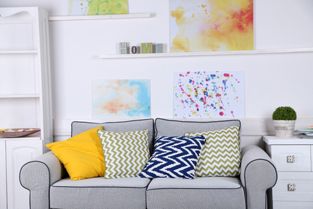
Sitting Rooms: Layered Textures for Cosy Comfort
The sitting room is where Scandi simplicity and British snugness really shine together. Choose a cool-toned sofa—think powder blue or dove grey—and layer it with chunky knit throws and cushions in mustard, navy, or earthy terracotta. Woven baskets (perfect for stashing magazines or throws) add storage without fuss, while a wool rug underfoot brings the whole look together. Don’t forget an accent lamp with a warm bulb to create that quintessential hygge glow as evening falls.
Textiles: Mixing Patterns & Fabrics
Mixing tactile textiles is key to this fusion style. Combine crisp cottons with velvet cushions in botanical prints—a nod to classic British florals—while keeping the palette grounded in Scandi-inspired neutrals. A tartan blanket casually draped over an armchair effortlessly marries both aesthetics.
Plants: Bringing Life Indoors
No Scandi-British space feels complete without greenery. Opt for easy-care plants like ferns, spider plants, or English ivy in simple terracotta pots or glazed ceramics. Not only do they clean the air, but they also soften clean lines and add natural colour throughout the year—a little reminder of the lush British outdoors, even when it’s grey outside.
By weaving these thoughtful touches into each room, you’ll find your home becomes a calm retreat filled with personality—where everyday living feels both ordered and inviting, whatever the weather may bring.