Introduction to British Bedroom Aesthetics
British bedrooms have long been a reflection of the nations unique approach to home life, where tradition meets comfort and personal expression. Unlike their continental counterparts, British interiors are celebrated for their rich sense of history, layered textures, and an unspoken invitation to cosiness—what the locals affectionately call “cosy” or “homely.” Colour schemes play a central role in this narrative, influencing how these private spaces feel and function. From the stately Georgian townhouses adorned with heritage hues to the contemporary flats in London experimenting with bold, modern palettes, colour choices in British bedrooms are never just about aesthetics—they speak volumes about cultural values, mood, and practicality. Understanding these colour preferences offers a window into everyday British living: it’s about creating a sanctuary that balances tradition with personal taste, all while being mindful of the ever-changing British light and weather. As we explore the evolution of colour schemes in British bedrooms, we’ll discover how each choice—from deep heritage greens to fresh pastel tones—carries its own story, rooted in both national identity and the rhythms of daily life.
2. Heritage Hues: The Influence of History
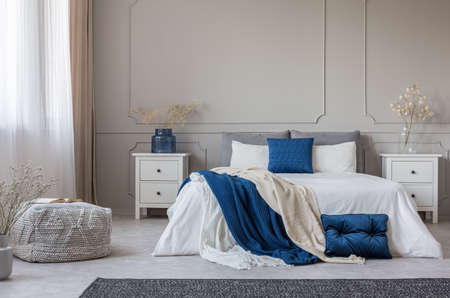
When it comes to creating a quintessentially British bedroom, heritage hues play an undeniable role. Drawing inspiration from centuries-old manor houses, countryside cottages, and Georgian terraces, these colour schemes evoke a sense of calm continuity and understated elegance. Brands like Farrow & Ball have become household names in Britain, largely due to their expertly curated palettes that reflect the nation’s rich design legacy.
Classic British bedrooms often feature muted greens reminiscent of the rolling Cotswold hills, deep blues inspired by the moody North Sea, and stony neutrals echoing historic stonework. These shades are not only beloved in period properties but are increasingly woven into modern flats for those who appreciate a connection to the past. Whether paired with antique furnishings or sleek minimalist décor, these colours offer versatility and longevity.
Key Heritage Colours and Their Associations
| Colour | Inspiration | Atmosphere Created |
|---|---|---|
| Muted Green (e.g., “Mizzle”) | Countryside landscapes, gardens | Calming, restorative, natural |
| Deep Blue (e.g., “Stiffkey Blue”) | Coastal vistas, historic libraries | Cosy, contemplative, sophisticated |
| Stony Neutral (e.g., “Elephant’s Breath”) | Traditional masonry, foggy mornings | Timeless, grounding, versatile |
The Enduring Appeal in Modern Living
Heritage hues are cherished not just for their beauty but also for their practicality. They hide everyday marks and scuffs well—an essential consideration for busy households or rental flats. Additionally, their subtlety allows for layering textures and accessories without feeling cluttered—a favourite approach among British interior enthusiasts who value both order and warmth.
Blending Old and New: A Practical Approach
If you’re looking to bring a bit of history into your bedroom without overwhelming the space, consider using heritage colours as a base. Add contemporary touches with metallic light fixtures or crisp white bedding for a look that feels fresh yet rooted in tradition. This harmonious blend embodies the best of British interiors: respecting the past while making room for modern life.
![]()
3. Modern Palettes: Contemporary Choices in Urban Living
As British bedrooms evolve alongside the fast pace of urban life, modern colour palettes have begun to make a distinct mark on interior design. Homeowners and flat dwellers alike are gravitating towards shades that echo both personal expression and practical living. Bold accents—think emerald feature walls or ochre throws—inject character without overwhelming compact London flats or suburban terraces. These lively pops of colour often find their place against backdrops of calm neutrals, such as soft greys, creamy whites, or gentle sage greens, striking a balance between vibrancy and tranquillity.
This trend towards minimalist, soothing tones is no accident; it reflects an increasing desire for restful retreats amidst the bustle of city living. Scandinavian-inspired palettes, with their emphasis on light and space, have gained traction in British bedrooms, marrying function with understated beauty. At the same time, moody hues like deep navy or charcoal are chosen for those wanting a cocooning effect—perfect for winding down after a long day navigating the Tube or bustling markets.
The rise of contemporary colour choices also hints at shifting lifestyles: more people are working from home, seeking serenity where they sleep and work. Bedrooms double as sanctuaries, so design preferences lean towards colours that soothe rather than stimulate. This thoughtful approach ensures that even in the smallest box room or loft conversion, the palette serves not just aesthetic appeal but everyday well-being—a subtle yet significant shift in British bedroom culture.
4. Regional Differences and Inspirations
One of the most charming aspects of British bedroom colour schemes is how deeply they are rooted in local landscapes and traditions. Across the UK, from Cornwall’s breezy coastlines to the windswept Highlands of Scotland, the natural environment plays a decisive role in shaping the palettes chosen for bedrooms. These regional influences not only bring a sense of place indoors but also offer a subtle nod to heritage while embracing contemporary living.
Coastal Calm: Cornish Blues and Whites
Cornwall, with its stunning seascapes and ever-changing skies, inspires bedrooms with airy, light blues and crisp whites. These hues reflect the clarity of coastal light, conjuring feelings of openness and relaxation—a perfect fit for a restful retreat. Homeowners often lean into sandy beiges or sea-glass greens as accents, creating a palette that feels both timeless and fresh.
Moody Hues: Scottish Greys and Greens
In Scotland, the palette takes on a richer, moodier tone. The rolling hills and dramatic weather inspire deep greys, heather purples, and mossy greens. Bedrooms here often embrace these enveloping shades to evoke warmth and comfort during long evenings or chilly mornings. These colours pair beautifully with tactile fabrics such as tweed or wool for an authentic touch.
Comparing Regional Colour Schemes
Region |
Key Influences |
Main Colours |
Typical Accents |
|---|---|---|---|
| Cornwall & Coastal South West | Seascapes, Sky Light | Soft Blues, Crisp Whites | Sandy Beiges, Sea-glass Greens |
| Scottish Highlands | Heather Moors, Misty Weather | Pewter Grey, Moss Green, Heather Purple | Deep Burgundy, Rustic Ochre |
| The Lake District & North England | Lakes, Woodlands | Sage Green, Slate Blue | Muddy Browns, Stone Grey |
| Londonderry & Northern Ireland | Dramatic Coastlines, Ancient Forests | Misty Blue-Grey, Fern Green | Bog Brown, Pale Yellow |
| The Cotswolds & South East England | Rolling Meadows, Honey Stone Villages | Creamy Neutrals, Soft Greys | Pale Pink, Duck Egg Blue |
A Reflection of Local Identity at Home
By drawing inspiration from their immediate surroundings, Britons create bedrooms that reflect both personal taste and a collective sense of identity. This regional approach results in interiors that feel grounded yet adaptable—where heritage hues meet modern palettes in perfect harmony.
5. Practical Considerations: Light, Space, and Wellbeing
When curating the perfect colour scheme for a British bedroom, practicality is just as important as style. Many UK homes—particularly charming but compact Victorian terraces—pose unique challenges that are best addressed through thoughtful use of colour.
Maximising Natural Light
The famously unpredictable British weather means natural light can be in short supply, especially during those long winter months. To counteract this, lighter shades such as soft creams, gentle greys, or muted pastels are often favoured on walls and ceilings. These hues help bounce available daylight around the room, creating a brighter and more uplifting atmosphere even on grey mornings. If your bedroom faces north or tends to feel gloomy, steering clear of dark colours on large surfaces will keep things feeling airy rather than oppressive.
Creating the Illusion of Space
With many traditional British homes offering snug bedroom proportions, clever colour choices can work wonders in making a space feel larger than it is. Pale tones visually expand the room, while painting skirting boards and cornices in the same shade as the walls removes hard boundaries and tricks the eye into perceiving a more open environment. If you crave a touch of drama without sacrificing spaciousness, consider keeping bold colours to accent pieces—think statement headboards or scatter cushions—rather than overwhelming every wall.
Supporting Wellbeing: Mood and Sleep
The colours we surround ourselves with have a profound impact on our daily mood and quality of sleep—a fact not lost on the British homeowner seeking sanctuary from everyday hustle. Calming palettes inspired by nature—sage greens, dusky blues, or soft blush—promote relaxation and restfulness. Conversely, overly stimulating hues like fiery reds or vibrant yellows are best reserved for other areas of the home where energy is welcome. For many, creating a restful retreat means choosing colours that not only look beautiful but also support restorative sleep and gentle awakenings.
Everyday Comfort Meets Classic Style
Ultimately, balancing these practical considerations ensures your bedroom is both a visual delight and a true haven for daily living. Whether you’re updating a period property or styling a new-build flat, mindful colour choices tailored to British light and lifestyle make all the difference in transforming your bedroom into a restful and inviting space.
6. Conclusion: Harmonising Personal Taste and Cultural Roots
When it comes to crafting the perfect British bedroom, the interplay between colour schemes, personal taste, and cultural heritage is at the heart of every decision. The allure of heritage hues—like soft sage greens, deep navy blues, or gentle blush pinks—often reflects a collective nostalgia for Britain’s storied past, while modern palettes open the door to fresh interpretations and contemporary living. Yet, the real magic lies in striking a balance: blending colours that speak to your individual sense of comfort with shades that echo the broader British tradition of cosiness and understated elegance.
It’s important to consider not only what pleases the eye, but also what suits your lifestyle. Practical needs—such as maximising natural light in a north-facing room or creating a restful space for sleep—should guide your choices alongside aesthetic preferences. British homes have long celebrated an eclectic mix, where family heirlooms meet modern design and classic motifs coexist with bold accents. This layered approach allows you to weave your own story into the fabric of your bedroom, whether you favour timeless neutrals or are tempted by the latest trend-led tones.
Ultimately, embracing both your personal inclinations and the subtle cues of British design culture will help you create a space that feels truly yours—a sanctuary that balances beauty with functionality. Don’t be afraid to experiment with paint swatches, textured fabrics, or unexpected combinations until you find what feels right. Your bedroom should reflect not only who you are but also where you come from—a harmonious blend of self-expression and national character. So go ahead: explore, personalise, and let your chosen palette make every day feel just a little more like home.