1. Introduction to British Heritage Colours
When we speak of British heritage colours, we evoke a palette that is steeped in centuries of culture, history, and tradition. These shades are more than mere pigments; they are visual echoes of the United Kingdom’s storied past, reflecting the interplay between social class, regional identity, and evolving tastes. Heritage colours have adorned the walls of grand Georgian townhouses, rural Victorian cottages, and even the stately exteriors of Tudor manors. At their core, these hues are defined by their deep-rooted connections to specific periods—each carrying the subtle nuances of materials available at the time, prevailing artistic movements, and the aspirations or constraints of those who chose them.
The cultural significance of heritage palettes lies in their ability to bridge eras: they speak not only to the grandeur of aristocratic estates but also to the practical sensibilities of working-class homes. Rich earth tones, muted blues, and historic greens tell stories about Britain’s relationship with its landscape, while sophisticated creams and dusky pinks hint at continental influences and changing fashions. Within both interiors and exteriors, these colours have become markers of authenticity—a way for homeowners and designers alike to pay homage to the past while grounding spaces in a distinctly British sensibility. In essence, British heritage colours encapsulate a visual dialogue between continuity and change, offering an enduring sense of place that is recognisable across generations.
2. Georgian Grandeur: Subtlety and Symphony
The Georgian era, spanning from 1714 to 1830, marked a period of remarkable refinement in British interior design—a true symphony of subtlety that continues to influence heritage aesthetics today. This epoch embraced the Enlightenment’s rationality and order, which was elegantly translated into restrained colour palettes that graced the drawing rooms and stately halls of Britain’s landed gentry.
The Palette of Enlightenment
Rather than ostentatious displays, Georgian interiors favoured sophisticated restraint. Gentle greys, muted greens, and delicate blues became hallmarks of this period, reflecting both the cool composure and intellectual curiosity that defined the age. These hues were carefully chosen not only for their visual harmony but also for their association with decorum, civility, and a cultivated lifestyle.
Georgian Colour Characteristics
| Colour | Tone Description | Cultural Resonance |
|---|---|---|
| Sophisticated Greys | Soft, dove-like shades often used on walls and woodwork | Symbolic of rationality, balance, and understated luxury |
| Muted Greens | Earthy, sage-inspired tones found in salons and libraries | Echoes a connection to nature and pastoral ideals |
| Gentle Blues | Pale sky or powder blues adorning ceilings and parlours | Evokes serenity and intellectual enlightenment |
Contextual Influences
The Georgian approach was deeply shaped by classical antiquity; architects like Robert Adam drew inspiration from Greco-Roman principles of symmetry and proportion. The restrained palette underscored these values while remaining practical—lime-based paints with natural pigments allowed for subtle gradations that aged gracefully over time. These colours were as much a social statement as an aesthetic choice, signifying the refined tastes of those who inhabited such spaces.
In essence, the Georgian era set a lasting precedent for British heritage colour schemes: quietly dignified yet quietly expressive, their palettes remain emblematic of a uniquely British blend of tradition, intellect, and taste.

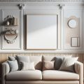
3. Victorian Richness: Opulence in Saturation
The Victorian era, spanning from 1837 to 1901, marked a profound transformation in the British approach to colour within domestic and public spaces. With the burgeoning innovations of the Industrial Revolution, previously rare pigments became more accessible, leading to an explosion of deeper, richer hues in both stately homes and burgeoning urban terraces. The palette of this period was defined by saturated shades such as burgundy, forest green, ochre, and navy—each carrying its own cultural resonance and reflecting the era’s imperial ambitions and fascination with ornate detail.
Burgundy: The Colour of Affluence
Burgundy was not merely a fashion statement; it symbolised status and prosperity. This deep red adorned drawing rooms and libraries, echoing the velvet upholstery and heavy drapes favoured by the Victorians. Its presence signalled a connection to both continental luxury and British tradition, making it a mainstay in grand households across the nation.
Forest Green: Nature Reimagined Indoors
With urbanisation rapidly changing the landscape, forest green became a way for Victorians to reconnect with nature within their increasingly industrial cities. Used on wood panelling and wallpaper motifs, this shade evoked lush countryside estates and the enduring English love affair with gardens—even when surrounded by London’s soot-stained brickwork.
Ochre & Navy: The Empire’s Influence
The inclusion of ochre and navy in Victorian palettes reflected Britain’s expanding global reach. Ochre—earthy yet opulent—was inspired by colonial encounters and archaeological discoveries in Egypt and beyond, while navy blue echoed naval supremacy and reliability. Together, these colours underscored not just personal taste but also national identity, weaving Britain’s imperial narrative into the very fabric of everyday interiors.
The result was a visual richness that still defines heritage properties today. Through this complex interplay of innovation, aspiration, and ornamentation, the Victorians set a benchmark for British interior colour schemes—a legacy that continues to influence contemporary interpretations of heritage design.
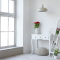
4. Edwardian Lightness: Airy Elegance
The Edwardian era (1901–1910) marked a distinct shift in British interior colour palettes, moving away from the rich, heavy tones of the Victorian period to embrace a sense of lightness and refined elegance. This transformation was not merely aesthetic but deeply connected to wider societal changes, including increased access to the countryside and a growing appreciation for nature. The new century brought with it a desire for freshness and understated glamour, reflected in both architecture and interior design.
Pastel Tones and Crisp Whites: A Reaction to Victorian Opulence
Edwardian interiors became synonymous with pastel hues—think delicate duck egg blues, gentle lilacs, soft sage greens, and blush pinks—paired with crisp whites that lent rooms a sense of airiness and space. Gone were the dark maroons and forest greens; instead, homes embraced a palette that felt open and inviting. This move towards lighter shades was seen as both modern and wholesome, aligning with contemporary values of health, hygiene, and optimism.
Botanical Motifs and Nature’s Influence
With railways making rural escapes more accessible, the British public developed an affinity for the outdoors that quickly found its way indoors. Botanical motifs—floral wallpapers, leaf stencils, and ornamental ferns—became hallmarks of Edwardian décor. These patterns were often executed in subdued tones or white-on-white relief, further contributing to the gentle sophistication of Edwardian spaces.
Key Edwardian Colour Characteristics
| Colour/Element | Description | Cultural Significance |
|---|---|---|
| Pale Pastels (blue, green, pink) | Used on walls, ceilings, soft furnishings | Evoked freshness, openness, and tranquillity |
| Crisp White Paintwork | On mouldings, window frames, doors | Suggested cleanliness and modernity |
| Botanical Motifs | In wallpapers & textiles | Brought elements of nature inside urban homes |
| Subtle Metallic Accents | Brass or silver highlights on fittings | A nod to understated glamour without excess |
This Edwardian approach set the stage for later twentieth-century design movements by establishing lightness as an enduring value in British interiors. It captured a national mood keen on renewal—balancing tradition with a forward-looking freshness that still resonates in heritage paint ranges across the UK today.
5. Modernist Shifts and Post-War Practicality
The mid-20th century marked a profound transformation in British heritage colour palettes, shaped by the dual forces of Modernism and the realities of post-war Britain. This period was a study in contrasts: on one hand, post-war austerity dictated a restrained approach to colour; on the other, the optimism of Modernism inspired fresh, forward-looking hues that would redefine British interiors.
Austerity and Utility: The Immediate Post-War Years
In the aftermath of the Second World War, scarcity and rationing were the order of the day. Paint pigments were limited, and practicality trumped ornamentation. British homes adopted muted greys, off-whites, and utilitarian greens—tones closely linked to military surplus and institutional settings. These colours spoke not only to necessity but also to a spirit of resilience; they were functional yet quietly dignified, embodying a national mood focused on rebuilding and making do with less.
The Modernist Influence: Simplicity with Purpose
As prosperity slowly returned, Modernist design philosophies gained traction across Britain. Architects and designers drew inspiration from continental trends, celebrating simplicity, clean lines, and honest materials. The colour palette responded in kind—think crisp whites, charcoal blacks, and primary accent colours. These shades were not chosen for extravagance but for clarity and purpose; each hue served to highlight structure or foster a sense of space, reflecting the modern drive towards efficiency and transparency.
Mid-Century Optimism: Colour Returns with Confidence
By the late 1950s and early 1960s, a newfound optimism began to blossom. British paint manufacturers introduced pastel pinks, sunlit yellows, duck-egg blues, and leafy greens—the sort of cheerful tones that signalled hope for better days ahead. While still anchored in practicality, these choices embodied an emerging desire for self-expression and comfort in daily life. The result was a uniquely British take on modern living: pragmatic yet playful, resilient yet ready to embrace change.
This era’s colour palettes reveal much about the nation’s evolving identity—balancing hardship with hope, tradition with innovation. In their subtlety and strength, these hues continue to echo throughout British design sensibilities today.
6. Contemporary Interpretations: Reviving and Reinventing
Today’s British interiors are experiencing a vibrant renaissance, where historical colour palettes are not merely referenced but actively reclaimed and reinvented for modern living. The resurgence of heritage hues is evident in the offerings of renowned paint houses such as Farrow & Ball and Little Greene, whose meticulously researched collections draw directly from archival tones found in Georgian townhouses, Regency mansions, and Victorian terraces. Yet, these colours are no longer confined to their original settings; instead, they are woven into contemporary narratives that reflect today’s eclectic sensibilities.
Designers and homeowners alike are embracing the nostalgic warmth of muted sages, deep ochres, and dusky pinks—shades once reserved for stately homes or rural cottages—and pairing them with minimalist furnishings or industrial elements. This interplay between old and new creates spaces that feel both rooted in British tradition and strikingly current. The tactility of chalky finishes, for instance, brings a tactile depth reminiscent of historic limewash walls while suiting the understated luxury favoured by contemporary tastes.
Sustainability has become a key driver behind the revival of heritage palettes. Brands such as Little Greene pride themselves on environmentally responsible production methods, using natural pigments and water-based formulas that echo the craftsmanship of earlier centuries while meeting today’s ethical standards. By choosing paints that honour both historical accuracy and eco-conscious innovation, modern British interiors bridge past and future in meaningful ways.
The reinterpretation extends beyond colour alone. In many urban flats and country retreats, period-inspired shades are applied unconventionally: feature walls in Drawing Room Blue offset by bold artwork, or kitchen cabinetry in Olive Green juxtaposed with polished concrete floors. Such juxtapositions reflect a contemporary British ethos—one that values individuality and narrative layering over rigid stylistic rules.
Ultimately, this dynamic approach ensures that heritage palettes remain relevant. They offer continuity with Britain’s rich decorative history while allowing personal expression to flourish. Through careful curation and creative reinvention, today’s interiors celebrate the enduring legacy of British colour—proving that what is old can always be made new again.