Understanding British Natural Light
One of the defining features of the British home is its relationship with natural light. The UK is renowned for its temperate climate, where overcast skies and gentle daylight are more common than blazing sunshine. This unique atmospheric quality shapes how colours appear indoors, often muting vibrancy and casting a soft, diffused glow throughout living spaces. When considering whether to opt for bold or subtle paint intensities, it’s essential to recognise how these lighting conditions influence perception. Strong sunlight can amplify bright tones, but in Britain’s softer light, even vivid hues may appear more subdued, while pale shades can risk looking washed out or flat. Understanding this interplay between weather and colour is fundamental—what appears dramatic on a paint chart under harsh showroom lights might translate quite differently once brushed onto your walls beneath a typical British sky. As such, the very nature of UK daylight serves as both backdrop and filter, underpinning every decision about paint intensity within the British context.
2. Interpreting Bold and Subtle Paint Tones
When selecting paint for British interiors, the distinction between ‘bold’ and ‘subtle’ tones is deeply rooted in both practical concerns and cultural preferences. A ‘bold’ paint tone typically refers to hues that are saturated, rich, or striking—think deep emerald greens, dramatic navies, or even vibrant ochres. In contrast, a ‘subtle’ tone leans towards softer, muted palettes such as misty greys, powder blues, or sage greens. These subtle tones often have more grey or earth undertones, resulting in a nuanced finish that shifts gently with changing light.
Within the British context, these choices are not merely aesthetic—they’re shaped by tradition, climate, and social sensibilities. The UK’s famously variable light conditions mean that colours can appear significantly different from room to room or season to season. Therefore, understanding how bold and subtle tones behave under typical British daylight (often diffuse and soft) versus artificial evening lighting is key.
| Paint Tone | Characteristics | Cultural Perception in Homes | Cultural Perception in Public Spaces |
|---|---|---|---|
| Bold | Vivid, saturated, high-contrast; makes a statement | Seen as daring or contemporary; often used as feature walls or accents; associated with personality and confidence | Used to create impact—restaurants, galleries, boutique shops—but may be considered overwhelming in large doses |
| Subtle | Muted, low-saturation, gentle transitions; easy on the eyes | Associated with calmness and tradition; favoured for creating restful spaces; aligns with notions of ‘cosiness’ and understatement | Preferred in heritage sites, hotels, offices; connotes sophistication and timelessness |
This interplay of tone and perception reflects broader British attitudes towards restraint versus expression. Historically, subtlety has been linked with heritage homes—think National Trust properties with soft Farrow & Ball hues—while bold colours are more likely to be embraced in modern refurbishments or creative industries. Ultimately, choosing between bold and subtle is not just about colour—it’s about signalling mood, intent, and respect for the architectural context within which the paint will live.

3. Matching Intensity to Interior Architecture
When choosing paint intensity for British homes, the architectural context is pivotal. Britains rich architectural heritage—from Victorian terraces and Edwardian semis to sleek, modern flats—directly informs which hues and strengths will harmonise or clash with a space. For instance, period properties with ornate cornicing, high ceilings, and sash windows often carry a visual weight that can support deeper, more saturated shades without overwhelming the room. Here, bold navies, heritage greens, or even dramatic greys can enhance original features and evoke a sense of history, especially when offset by crisp white woodwork or ceiling roses.
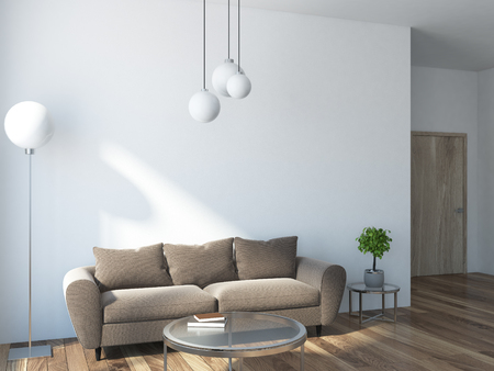
Conversely, many contemporary British flats tend towards open-plan layouts and abundant glazing but may have more compact proportions. In these environments, subtlety often prevails: lighter neutrals, soft pastels, and gentle mid-tones help maximise available light and make spaces feel more expansive. Clean lines and minimalist details in modern architecture respond well to understated palettes that don’t distract from structural clarity. Yet even in new-builds, an accent wall in a punchy colour—if applied thoughtfully—can introduce personality without encroaching on precious daylight.
It’s also important to consider materiality: exposed brickwork or original timber beams in older properties can be complemented by both bold and subtle paints, depending on whether you wish to highlight their texture or allow them to recede. Ultimately, aligning paint intensity with the era and character of your British interior not only respects the building’s story but also ensures a visually cohesive result that feels authentically rooted in its setting.
4. Playing with Light: The Role of Artificial Illumination
When considering paint intensity for British homes, artificial lighting is not merely an afterthought—it is a defining element in how colours are ultimately perceived. In the UK, the preference leans towards ‘warm white’ bulbs and traditional lampshades, both of which impart a distinct character to interiors. Unlike the harsh coolness of some continental or North American lighting, British artificial illumination tends to soften tones and create inviting atmospheres, but it can also dramatically alter the apparent depth and vibrancy of your chosen paints.
How Warm White Bulbs Shape Paint Perception
Warm white bulbs (typically 2700K–3000K) imbue rooms with a gentle golden glow reminiscent of candlelight. This subtlety can mute bolder shades, lending them an unexpected richness and complexity, while also elevating the warmth of paler hues. Conversely, cooler paints may seem flatter or even slightly greyed out under this light. The quintessentially British fondness for layered lamps—think fabric-shaded table lamps, standard lamps in reading corners, and wall sconces—multiplies these effects by creating pockets of varying intensity throughout a room.
Comparing Lighting Types: A British Context
| Lighting Type | Typical Use in British Homes | Effect on Bold Paints | Effect on Subtle Paints |
|---|---|---|---|
| Warm White Bulb (2700K) | Living rooms, bedrooms, hallways | Mutes vivid colours; adds cosiness | Enhances creaminess and warmth |
| Traditional Table Lamp | Sitting areas, bedside tables | Creates focused pools; softens edges | Makes neutrals feel inviting |
| Wall Sconce with Shade | Corridors, stairwells | Diminishes harsh contrasts; blends tones | Adds intimacy to pale shades |
| LED Cool White (4000K+) | Kitchens, bathrooms (less common) | Crispens bold hues; can appear stark | Makes pastels look clinical or cold |
The Importance of Layering Light Sources
A single overhead bulb seldom suffices for the nuanced approach favoured in British interiors. By strategically mixing lamp types and intensities, homeowners can ‘tune’ their space: amplifying or tempering paint choices as desired. For those torn between bold statements and subtler schemes, experimenting with different lamp arrangements before committing to a colour can reveal surprising possibilities—and pitfalls unique to the UK’s idiosyncratic approach to domestic lighting.
5. Practical Tips: Navigating Intensity Decisions
Choosing the right paint intensity in the UK isn’t just a matter of taste—it’s a nuanced process, shaped by Britain’s famously changeable climate and unique architectural heritage. Here’s how to approach testing, sampling, and selecting paint shades that truly fit British lighting conditions and lifestyles.
Test Colours in Context
The interplay between paint and light is crucial in the UK, where natural daylight can shift dramatically from one hour to the next. Before committing, always sample your chosen shades on multiple walls within the intended room. Observe them at different times of day—what looks bold at noon may turn moody under an overcast sky or during twilight hours. For period homes with smaller windows, subtler tones often help maximise available light, whereas more modern spaces with generous glazing can carry bolder choices.
Account for Seasonal Shifts
Britain’s long winters and short daylight hours demand careful consideration. In north-facing rooms or during the darker months, even vibrant hues may appear subdued. Try painting large tester patches and living with them for a week to see how they behave as weather and sunlight fluctuate—a distinctly British necessity!
Consider Lifestyle & Functionality
Think practically about how each space is used. For high-traffic areas like hallways or kitchens, mid-intensity paints often balance durability with visual warmth. In restful spaces such as bedrooms, subtle shades can foster calm—especially important for winding down during those early winter nights. Conversely, a bold feature wall in a living room can inject personality, particularly when paired with quintessentially British décor like deep Chesterfield sofas or patterned textiles.
Cultural Nuance: British Restraint vs. Expressiveness
It’s worth reflecting on the British sensibility for understated elegance. While there’s a growing appetite for bolder schemes inspired by contemporary designers, many homeowners still prefer to nod towards tradition with muted greens, blues, and greys—tones that reflect both the landscape and a sense of continuity with the past.
Final Selection: Trust Your Eye
Ultimately, there’s no substitute for seeing colours in situ. Use sample pots liberally and invite feedback from family or friends; after all, a collective British cup of tea while debating ‘Oxford Blue’ versus ‘Cornforth White’ is part of the fun. When in doubt, err on the side of subtlety—colours can always be layered or brightened later to suit evolving tastes and changing seasons.
6. Embracing British Design Preferences
When it comes to selecting paint intensity for British lighting conditions, understanding the broader landscape of British interior design is crucial. The UK’s interiors have long been shaped by a distinct blend of heritage and contemporary influences. On one hand, there is an enduring affection for heritage colours—think deep greens, muted blues, and rich burgundies—that pay homage to historic manor houses and centuries-old townhouses. These shades often manifest as bold statements, lending character and a sense of tradition to spaces that might otherwise feel washed out under cloudy British skies.
Yet, modern British homes are equally defined by a growing affinity for minimalist palettes. Soft greys, warm whites, and gentle pastels reflect a desire for calmness and lightness, particularly in urban environments where natural light may be scarce. This trend towards subtlety is not just aesthetic; it is also practical, as lighter hues can help amplify whatever daylight enters the home, making rooms appear larger and more inviting.
The interplay between these two trends—bold heritage hues versus understated modern tones—offers homeowners a spectrum of choices. For some, the answer lies in blending both approaches: using bold colour as an accent against an otherwise neutral backdrop, or layering subtle variations of a single shade to create depth without overwhelming the senses.
Ultimately, choosing between bold or subtle paint intensity in Britain is about responding to both the physical environment and prevailing cultural tastes. It’s a negotiation between history and modernity, drama and restraint. Whether you gravitate towards the timeless charm of saturated colour or the tranquil sophistication of muted tones, your decision should enhance not only the room’s appearance but also its relationship with the uniquely changeable British light.