Introduction to Victorian Colour Palettes
The Victorian era, spanning from 1837 to 1901 under Queen Victoria’s reign, left an indelible mark on British interior design, especially through its distinctive approach to colour. Victorian colour palettes are renowned for their opulence and depth, reflecting both the technological advances of the Industrial Revolution and a newfound fascination with global influences. Rich jewel tones—such as deep burgundy, forest green, navy blue, and ochre—were often paired with intricate patterns and ornate detailing, creating interiors that felt both cosy and grand. These schemes were not only a testament to personal taste but also a symbol of status and sophistication. The influence of Victorian colours remains evident in many British homes today, inspiring homeowners to recreate their timeless elegance while adapting them to modern sensibilities. By exploring these essential palettes, you can infuse your own home with the enduring character and charm that defined one of Britain’s most celebrated design periods.
Key Colours of the Victorian Period
The Victorian era, spanning from 1837 to 1901, is celebrated for its rich and varied use of colour, reflecting both technological advancements in pigment production and a fascination with history and nature. When considering an authentic Victorian palette for your home, understanding the essential hues and their cultural significance is key. Below is a breakdown of the most iconic colours and their meanings during this period.
| Colour | Description | Cultural Significance |
|---|---|---|
| Deep Greens (e.g., Olive, Emerald) | Lush, dark greens often used in libraries and drawing rooms | Evoked a sense of stability, wealth, and connection to nature; inspired by Gothic revival trends |
| Rich Reds (e.g., Burgundy, Claret) | Warm reds found in parlours and dining rooms | Symbolised luxury and hospitality; associated with warmth and formality |
| Bold Blues (e.g., Prussian Blue, Navy) | Intense blues popularised by new synthetic dyes | Signified sophistication and modernity; often paired with gold or cream accents |
| Mellow Yellows & Golds | Mustard yellows and antique golds featured in wallpapers and trims | Brought light into dimly lit rooms; suggested opulence without garishness |
| Subtle Neutrals (e.g., Stone, Taupe, Cream) | Softer shades used as backgrounds or on ceilings to balance stronger colours | Conveyed restraint and taste; allowed ornate furnishings to take centre stage |
| Purple & Mauve Tones | Pale lilacs to deep purples made possible by chemical dyes like mauveine | Represented innovation in colour technology; associated with royalty and spirituality |
The Art of Layering Colour
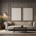
Victorian interiors rarely relied on a single shade. Instead, rooms were layered with complementary tones: walls in deep jewel colours contrasted against neutral ceilings and ornate woodwork. Patterns—floral, damask, or geometric—further enriched these palettes. This deliberate use of colour not only showcased status but also reflected the eclectic tastes brought about by global influences during Queen Victoria’s reign.
Regional Nuances in British Homes
While grand townhouses in London might boast dramatic emeralds and claret reds, rural cottages often favoured earthier greens and soft creams. The choice of palette was as much about practicality—hiding soot or maximising available light—as it was about aesthetics.
Choosing Your Own Victorian-Inspired Palette
If you want to recreate this timeless style at home, start by selecting one or two dominant hues from the table above. Accent them with period-appropriate neutrals or metallic touches for authenticity. Remember: the true spirit of Victorian colour lies in thoughtful layering and a respect for both tradition and innovation.
![]()
3. Selecting Paints and Wallpapers in the UK
Achieving an authentic Victorian colour palette in your home starts with choosing the right paints and wallpapers, ideally sourced from reputable British suppliers. The UK boasts a rich heritage of paint and wallpaper brands that specialise in period-accurate finishes and designs, ensuring your interiors reflect true Victorian elegance.
Heritage Paint Brands
For paints, look to established British names renowned for their historic collections. Farrow & Ball, Little Greene, and Crown Historic Colours offer palettes inspired by original 19th-century shades, from deep forest greens and rich burgundies to dusky blues and warm neutrals. These brands often use traditional pigments and finishes, such as matt emulsion or eggshell, to evoke the subtle depth typical of Victorian walls and woodwork.
Authentic Wallpapers
When it comes to wallpaper, opt for manufacturers like Morris & Co., Sanderson, or Zoffany, all of which produce faithful reproductions of classic Victorian patterns. Look for ornate florals, damasks, stripes, and motifs inspired by nature—hallmarks of the era’s decorative style. Many British suppliers also provide hand-printed or block-printed options for an even more genuine finish.
Sourcing Tips
- Visit local decorators’ merchants or heritage paint specialists for expert advice on period colours and application methods.
- Check if your chosen supplier holds a Royal Warrant or collaborates with heritage organisations such as English Heritage or the National Trust, which often endorse historically accurate products.
- Order sample pots or swatches before committing, as natural British light can affect how colours appear in your home.
Final Thoughts
Selecting authentic Victorian-style paints and wallpapers from trusted UK suppliers not only enhances the historical integrity of your interior but also supports traditional craftsmanship. With careful sourcing and attention to detail, you can recreate the timeless charm of Victorian decor while embracing high-quality British materials.
4. Room-by-Room Colour Application
Recreating the essential Victorian colour palettes in a modern British home requires both historical awareness and practical adaptation to contemporary living. Each room had its own character, and choosing the right colours is key to capturing that authentic period feel while maintaining comfort and functionality.
Drawing Room
The Victorian drawing room was a place of sophistication, socialising, and display. Rich shades such as deep reds, olive greens, or peacock blues were popular, often paired with ornate cornicing or dado rails in lighter tones. To adapt this for a modern setting:
- Use a statement wall in a bold shade like Burgundy or Forest Green.
- Balance with neutral or stone-coloured trims to prevent the space from feeling oppressive.
- Introduce velvet or damask soft furnishings for period authenticity.
Hallway
Hallways set the tone for the rest of the house and were typically painted in darker, more durable hues due to heavy footfall. Think earthy ochres, chocolate browns, or deep navy:
- Opt for washable paint finishes that mimic Victorian durability.
- Add a runner with traditional patterns to reinforce the look.
- Paint woodwork in contrasting off-whites or creams for definition.
Bedroom
Victorian bedrooms embraced restful yet opulent palettes—dusky pinks, sage greens, or muted lavenders were favoured for their calming effect. Modern tips include:
- Select pastel versions of Victorian shades for a lighter touch.
- Pair with antique brass accents or floral wallpapers for authenticity.
- Avoid overly dark ceilings; keep them off-white to maintain airiness.
Kitchen
Kitchens in the Victorian era were functional spaces but still carried character through colour. Mid-greens, cream, and pale blues dominated:
- Choose durable eggshell finishes in heritage colours for cabinetry.
- Combine with natural materials like wooden worktops or quarry tiles.
- Add simple tongue-and-groove panelled walls painted in classic tones.
Quick Reference: Victorian Colours by Room
| Room | Main Colour Choices | Accent Suggestions |
|---|---|---|
| Drawing Room | Burgundy, Olive Green, Peacock Blue | Cream trims, Gold details |
| Hallway | Navy, Ochre, Chocolate Brown | Off-white woodwork, Patterned runners |
| Bedroom | Sage Green, Dusky Pink, Muted Lavender | Pale ceiling, Brass fittings |
| Kitchen | Pale Blue, Cream, Mid-Green | Wood worktops, Tiled splashbacks |
Practical Tip:
If you’re hesitant about committing fully to dark Victorian hues, consider using them on lower walls or as accent features while keeping upper sections lighter—a nod to original schemes that also suits modern British homes.
5. Caring for and Maintaining Historic Colours
Preserving the authentic charm of Victorian colour palettes in your home requires more than a careful choice of paint. To keep period-appropriate hues looking fresh and vibrant, it’s essential to embrace regular maintenance that respects both the materials and historical context of your interiors. Here are some practical, British-centric tips to help safeguard your heritage-inspired spaces.
Respect Traditional Surfaces
Victorian homes often feature original plasterwork, timber mouldings, and ornate cornices. When cleaning painted surfaces, avoid abrasive cleaners that can dull or damage delicate finishes. Instead, use a soft, barely damp cloth with a mild pH-neutral soap. For stubborn marks, opt for specialist products designed for historic properties, which are widely available from UK conservation suppliers.
Guard Against Damp and Condensation
Britain’s temperate climate means moisture is a persistent concern—particularly in older properties. Ensure good ventilation and promptly address any signs of damp or mould to prevent discolouration or peeling paint. Dehumidifiers, trickle vents, and regular window opening can all help maintain healthy humidity levels and prolong the life of your Victorian palette.
Touch-Up with Care
If chips or scuffs appear on high-traffic areas such as skirting boards or door frames, touch up using leftover paint from your original batch. Keep a detailed record of all colours used—including the brand and code—so exact matches are always at hand. For more significant restoration, consult specialists experienced in period properties to ensure sympathetic repairs.
Shield from Sunlight
Victorian paints were sometimes prone to fading under direct sunlight. Today’s formulations are far more robust, but it’s still wise to draw curtains or blinds during peak sun hours in south-facing rooms. Consider UV-filtering window films for added protection without compromising natural light.
Regular Inspections
Build a habit of conducting seasonal checks on your painted surfaces. Look for early signs of cracking, bubbling or flaking—especially around windows and external walls. Prompt action can prevent minor issues escalating into costly repairs, ensuring your carefully curated Victorian colours remain as impressive as the day they were applied.
6. Blending Victorian Colours with Contemporary British Style
Achieving a seamless balance between classic Victorian colour palettes and modern British interiors requires sensitivity to both heritage and practicality. Start by choosing a few key Victorian hues—such as rich forest greens, dusky blues, or oxblood reds—and use them as accent walls or within soft furnishings like cushions, throws, or rugs. This nod to history can be effortlessly paired with the clean lines and open spaces that characterise contemporary British homes. To avoid overpowering the space, balance deep tones with neutral shades such as warm greys, off-whites, or light taupes on larger surfaces.
Layering Textures and Patterns
Victorian interiors are renowned for their ornate patterns and layered textures. To reinterpret this for today’s homes, incorporate patterned wallpapers in a feature area—think botanical prints or subtle damasks in period-appropriate colours. Mix these with plain modern upholstery or sleek wooden flooring to keep the overall effect fresh rather than fussy.
Respecting Heritage Through Details
Retain original architectural features wherever possible: cornices, ceiling roses, or fireplaces painted in authentic Victorian shades provide a link to the past while sitting comfortably alongside modern fixtures. If your property lacks these details, consider adding period-inspired mouldings or vintage brass hardware for a respectful nod to tradition.
Practical Considerations for Modern Living
Modern living demands durability and ease of maintenance. Opt for high-quality paints and finishes that replicate traditional colours but offer contemporary stain resistance and longevity. When selecting textiles, choose robust weaves that echo Victorian opulence but stand up to everyday use.
By thoughtfully combining historical colour schemes with present-day functionality and aesthetics, you can honour Britain’s rich decorative legacy without compromising on comfort or practicality—resulting in a home that feels both timeless and entirely liveable.