Introduction: The British Weather and Home Life
When it comes to home life in the UK, there’s one topic that never fails to come up in conversation—the weather. Britain’s climate is renowned for its unpredictability, with grey skies, drizzle, and bursts of sunshine all possible within a single afternoon. This ever-changing forecast isn’t just a backdrop to daily life; it actively shapes routines, moods, and the way people interact with their living spaces. As Britons retreat indoors from blustery winds or settle in for a cosy evening while rain taps against the window, their relationship with interior design becomes deeply intertwined with the climate outside. It’s no wonder that the unique quirks of British weather have had such a profound influence on how interiors are styled, particularly when it comes to choosing colours that can brighten up a gloomy day or create warmth during chilly spells.
2. Light and Mood: Responding to Grey Skies
The famously unpredictable British weather is often characterised by weeks of soft grey clouds and gentle, persistent drizzle. These overcast days have a unique influence on the way Britons approach their interior spaces, particularly when it comes to colour choices. With limited natural sunlight, many households seek ways to counterbalance the gloom and infuse their homes with warmth and brightness.
Brightening Up with Lighter Tones
Lighter shades such as off-white, pale grey, muted blush, and pastel blue are commonly chosen to help maximise whatever daylight filters through the windows. These colours have a reflective quality that gently bounces available light around the room, making spaces feel more open and welcoming even when skies outside are leaden. It’s a subtle yet effective form of visual decluttering, helping interiors avoid feeling heavy or oppressive during long stretches of cloudy weather.
Popular Reflective Colours in British Homes
| Colour Shade | Effect on Space |
|---|---|
| Soft White | Amplifies light and creates a crisp, clean backdrop |
| Pale Grey | Adds modernity while maintaining brightness |
| Mist Blue | Elicits calmness and subtly reflects cool outdoor tones |
| Warm Beige | Introduces warmth without overpowering natural light |
Cultivating Cosiness: The ‘Hygge’ Effect in Britain
Beyond just brightening up rooms, these lighter colours also help foster a sense of cosiness—a trait highly valued in British interiors. Layering soft furnishings in complementary hues, incorporating natural textures like wood or wool, and using mirrors strategically all contribute to a snug retreat from dreary weather. In this way, Britons turn the challenge of grey skies into an opportunity to create inviting sanctuaries that lift spirits throughout the year.
3. Cosy Comfort: Embracing Warm Hues
It’s no secret that the British weather can often feel chilly, damp, and grey, especially during those long stretches of autumn and winter. This unique climate has a direct impact on how people in the UK approach interior colour choices. When the skies are overcast and rain taps against the windowpanes, there’s an almost instinctive desire to create a refuge that feels inviting and snug. As a result, many Brits lean towards warm, earthy tones—think deep ochres, terracotta, rich chestnut browns, and comforting mustard yellows—when decorating their homes. These colours don’t just brighten up a room; they seem to wrap around you like a soft blanket, making even the dreariest day feel more bearable. Opting for these hues helps to counterbalance the coolness outside, bringing a sense of warmth and comfort indoors. It’s not uncommon to find living rooms painted in soft clay or bedrooms adorned with rust-coloured throws and cushions. The overall effect is a space that encourages relaxation and togetherness—a true British sanctuary from the unpredictable weather beyond the doorstep.
4. Layering Textures and Colours: The British Way
Layering is at the heart of British interior design, and it’s a method that perfectly responds to the nation’s ever-changing weather. With seasons shifting rapidly from grey drizzle to crisp sunshine or moody twilight, British homes have evolved to become flexible, welcoming spaces that reflect the landscape outside while providing comfort within. This approach isn’t just about piling on throws and cushions; it’s a thoughtful process of combining colours and textures that mirror the subtleties of the local climate.
Inspired by Nature and the Skies
The British take cues from their surroundings—think rolling green hills, windswept heather, pebble beaches, and the dramatic skies of a passing storm. Layering inside often means juxtaposing muted base tones with brighter accents, echoing how sunlight breaks through clouds or how autumn leaves stand out against damp stone walls. This helps rooms feel vibrant on dreary days but never overwhelming.
Common Layering Combinations
| Texture | Colour Palette | Weather Inspiration | Effect in the Home |
|---|---|---|---|
| Wool & Velvet | Sage green, charcoal grey | Misty mornings, moorland fog | Cosy warmth, subtle sophistication |
| Linen & Rattan | Creams, soft blues, sand tones | Seaside light, gentle breezes | Airiness, relaxed calm |
| Cotton & Leather | Rust red, mustard yellow | Autumn leaves, late afternoon sun | Pops of energy, homely comfort |
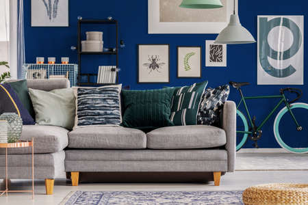
| Tweed & Oak Wood | Navy blue, forest green | Stormy skies, woodland walks | Grounded elegance, timelessness |
A Practical Approach to Layering for Every Season
The British way is not just about aesthetics—it’s practical too. As temperatures drop or rise unpredictably, layers can be added or removed: throws swapped for lighter textiles in summer, heavier curtains drawn in winter. Accessories like rugs and cushions change colour with the seasons—rich jewel tones for colder months, paler hues when light returns. This dynamic style keeps homes feeling inviting whatever the forecast.
5. Seasonal Shift: Adapting Colours Throughout the Year
One of the most charming aspects of British interiors is the way they quietly evolve in tune with the changing seasons. Rather than embarking on major redecorations, many households opt for a more subtle approach: updating soft furnishings and accent colours to reflect both the weather and quality of light outside. In winter, when days are short and skies often heavy with cloud, you’ll notice homes embracing deeper hues—think rich burgundies, forest greens, and navy blues—brought in through velvet cushions, heavy throws, and textured rugs. These additions not only add visual warmth but also provide much-needed comfort against the damp chill.
Come spring and summer, as natural light lengthens and gardens burst into bloom, there’s a gentle shift towards lighter, brighter accents. Homeowners swap out heavier textiles for linen or cotton in pastel tones or fresh floral prints. Even something as simple as a new set of curtains or a vase of seasonal flowers can completely transform the mood of a room. It’s a practical strategy rooted in tradition—making homes feel harmonious with the outside world while keeping décor flexible and ever-inviting. This adaptive style speaks to the British preference for both comfort and understated elegance, ensuring living spaces always feel just right, whatever the weather.
6. Traditional and Contemporary Palettes: A Cultural Blend
When it comes to choosing interior colours in Britain, the unique blend of tradition and modernity is truly apparent. The British weather, with its shifting grey skies, sudden bursts of sunshine, and gentle mists, has historically inspired a preference for rich, heritage shades—think deep greens reminiscent of ancient woodlands or stately blues that echo the grandeur of country manors. These timeless colours not only evoke a sense of history but also bring warmth and comfort during long spells of dreary weather.
Yet, British interiors are far from stuck in the past. Contemporary design trends have woven in lighter neutrals, gentle blushes, and playful pops of colour, reflecting a desire for brightness and optimism even when the sun is hiding. This creates a fascinating interplay between old and new: walls painted in Farrow & Ball’s ‘Hague Blue’ might be offset by modern accents like mustard cushions or sleek metallic fixtures. It’s not uncommon to find period homes where traditional panelling meets minimalist Scandinavian-inspired furniture—a testament to the British knack for mixing eras and influences effortlessly.
The result is a living space that feels both grounded in heritage and open to new possibilities, much like the British approach to weather itself: respect for tradition, but always prepared to adapt. Whether you favour the reassuring depth of Victorian greens or the fresh clarity of modern whites, embracing this cultural blend allows your home to tell its own story—one shaped by both history and the ever-changing light outside your window.