Introduction to Heritage Colours in British Design
Heritage colours hold a distinctive place in the story of British interior design, acting as a visual bridge between the nation’s rich past and its modern-day homes. Rooted in historical references, these hues are more than just decorative choices—they are echoes of eras gone by, conjuring the grand halls of Georgian manors, the understated elegance of Victorian terraces, and the rustic charm of countryside cottages. Many traditional paints and pigments originated from natural materials native to Britain, such as ochres, umbers, and earth tones sourced from local landscapes. These colours were not only practical but also reflective of regional identities and social aspirations. Today, heritage palettes continue to resonate within contemporary design trends across the UK. Their enduring appeal lies in their ability to evoke a sense of familiarity and timelessness while providing a subtle yet characterful backdrop for modern living. By weaving these storied shades into present-day interiors, British homeowners create spaces that honour tradition whilst embracing innovation—a testament to the ongoing dialogue between history and home.
2. Selecting Heritage Palettes for Modern Spaces
Integrating heritage colours into contemporary British homes requires a thoughtful approach that balances tradition with modern sensibilities. The process begins by understanding the unique qualities of historical palettes—deep ochres, muted greens, dusky blues, and warm neutrals—while ensuring these shades complement today’s open-plan layouts and sleek finishes.
Assessing Light and Orientation
British weather and natural light can dramatically alter how colours appear indoors. South-facing rooms receive more consistent sunlight, allowing for bolder or darker heritage hues such as deep red or forest green. Conversely, north-facing spaces benefit from lighter heritage tones like stone or sage to prevent the room feeling cold or cramped. It is practical to sample paint patches on different walls and observe their appearance at various times of day.
Balancing Space and Proportion
Contemporary homes often feature larger windows and open floor plans, which can handle stronger heritage colours without overwhelming the space. In contrast, smaller rooms or period features may call for subtler application, such as using heritage shades on accent walls or woodwork rather than all four walls. This approach respects the building’s character while keeping the space airy and inviting.
Practical Strategies for Harmonising Colours
| Strategy | Description | Typical Heritage Example |
|---|---|---|
| Zoning with Colour | Define areas within open-plan spaces using different but complementary traditional hues. | Sage green kitchen; warm grey dining area. |
| Layering Neutrals | Create depth by mixing multiple neutral heritage tones across walls, ceilings, and trims. | Limestone white walls; putty-coloured skirting boards. |
| Accent Features | Highlight architectural details with bold heritage shades. | Navy blue fireplace surround; burgundy window frames. |
| Mood Setting | Select colours based on the desired atmosphere—calm, cosy, or energising. | Duck egg blue for serenity; mustard yellow for warmth. |
Respecting Context and Personal Taste
The success of incorporating heritage colours lies in a measured blend of authenticity and individuality. While it is important to consider the home’s era and regional influences (such as Victorian terraced houses versus modern London flats), personal preference should guide the final palette selection. Experimentation through paint samples, fabric swatches, or mood boards helps achieve a cohesive result that feels both rooted in British history and tailored for present-day living.

3. Blending Old and New: Tips for Seamless Integration
When it comes to bringing heritage colours into contemporary British homes, the key is finding a balance between tradition and modernity. To achieve a cohesive look, start by selecting a classic colour palette inspired by Britain’s architectural past—think muted sage greens, deep navy blues, or warm terracotta hues. These timeless shades can serve as the backbone of your design scheme, creating a sense of continuity that grounds more modern choices.
Pairing these historic tones with sleek, modern furnishings is an effective way to bridge eras. For example, a heritage-inspired wall colour such as Farrow & Ball’s ‘Railings’ or Little Greene’s ‘Sage Green’ can be beautifully offset by minimalist furniture in natural oak or metal finishes. The contrast between old and new materials not only highlights each element but also adds visual interest without overwhelming the space.
Architectural features play a significant role in this blend. If you are fortunate enough to have original cornicing, exposed brickwork, or period fireplaces, consider accentuating them with carefully chosen heritage colours. For newer properties or extensions, introduce traditional hues through feature walls, painted joinery, or even coloured kitchen cabinetry. This approach maintains the characterful feel of British interiors while embracing the convenience and style of modern living.
Textiles and accessories offer another opportunity for integration. Layering soft furnishings in classic patterns—such as checks, florals, or damasks—can subtly reference the past without feeling dated. Pair these with contemporary artwork or lighting to ensure the overall effect remains fresh and current.
Ultimately, blending old and new is about restraint and thoughtful placement. By allowing both heritage colours and modern elements room to breathe, you create interiors that feel authentic yet forward-thinking—a true reflection of today’s evolving British home.
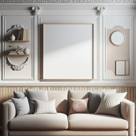
4. Feature Walls and Accents: Modern Applications
Introducing heritage colours into contemporary British homes need not mean a complete overhaul of your interiors. In fact, subtlety often creates the most sophisticated results. One of the most effective strategies is to use feature walls and accent details, harnessing the depth of heritage tones without overwhelming your living spaces.
Feature Walls: A Focal Point
Heritage shades such as deep olive, muted navy, or dusky rose can transform a plain wall into a statement piece. Opt for a single wall—perhaps behind a bed, sofa, or dining table—to anchor the room and provide visual interest. This approach allows you to embrace boldness without committing every surface to a strong colour.
Accents and Trims: Subtle Heritage Touches
If painting an entire wall feels too dramatic, consider applying heritage colours to smaller architectural features. Door frames, skirting boards, window trims, and alcoves are ideal candidates. These elements act as understated nods to tradition while maintaining a crisp, modern aesthetic.
Creative Methods for Incorporation
| Method | Description | Suggested Heritage Colours |
|---|---|---|
| Feature Wall | Create a single statement wall in a main living area or bedroom. | Olive Green, Deep Navy, Victorian Plum |
| Accent Trim | Paint skirting boards, picture rails, or window sills. | Pewter Grey, Classic Cream, Georgian Blue |
| Focal Furniture | Use heritage tones on standout furniture pieces like bookcases or cabinets. | Burgundy Red, Sage Green, Mustard Yellow |
Balance and Restraint
The key to success with heritage colours lies in balance. Pair rich shades with lighter neutral backgrounds—think off-white walls with Edwardian blue trims—to prevent the space from feeling heavy. Layering textures and soft furnishings in complementary tones can further harmonise the overall scheme.
5. Sourcing Authentic Paints and Materials Locally
Integrating heritage colours into modern British homes is not just about selecting the right shades—its equally about sourcing authentic materials that honour tradition while meeting contemporary standards. Fortunately, the UK boasts a wealth of suppliers dedicated to producing genuine, high-quality paints and finishes inspired by historic palettes.
Choosing Reputable Heritage Paint Brands
When it comes to authenticity, brands such as Farrow & Ball, Little Greene, and Edward Bulmer Natural Paints have established themselves as leaders in heritage-inspired pigments. These companies invest heavily in research to accurately reproduce period colours, often referencing original samples from National Trust properties and historic sites. Opting for these paints ensures not only colour fidelity but also compatibility with traditional British building materials.
Prioritising Sustainability and Local Craftsmanship
Sustainability is an essential consideration for today’s homeowners. Many heritage paint brands now offer eco-friendly formulas, using natural pigments and low-VOC bases that are kinder to both the environment and your indoor air quality. In addition to paint, seek out local artisans who craft lime plasters, clay-based finishes, or reclaimed timber for mouldings—these materials enhance authenticity while supporting the UK’s skilled tradespeople.
Supporting Local Producers
Visiting independent builders’ merchants or specialist restoration shops can yield unique finds, from traditional ironmongery to hand-thrown tiles. Engaging with local craftspeople not only results in a more bespoke finish but also helps sustain regional economies and time-honoured techniques. Don’t hesitate to ask about the provenance of materials—many artisans are passionate about sharing their knowledge.
Practical Tips for Homeowners
Begin your search with heritage paint stockists in your area; many offer sample pots so you can test shades in situ before committing. For larger renovation projects, consult with conservation specialists or architects familiar with period properties—they often have trusted contacts among local suppliers. Finally, consider joining workshops or open days at heritage sites to connect directly with craftspeople who specialise in traditional British building methods.
By prioritising local sourcing and embracing sustainable practices, you not only achieve an authentic aesthetic but also contribute positively to the ongoing story of British craftsmanship within your contemporary home.
6. Case Studies: British Homes Embracing Heritage Colours
Bringing theory into practice, several British homes stand out for their innovative yet respectful use of heritage colours within contemporary settings. These real-life examples not only showcase the versatility of traditional palettes but also demonstrate how they can be seamlessly integrated with modern design elements, providing both inspiration and practical guidance.
Urban Victorian Terrace in London
One notable example is a restored Victorian terrace in North London. Here, the owners retained original cornices and fireplaces, painting walls in Farrow & Ball’s ‘Railings’—a deep blue-black shade reminiscent of historical ironwork. Contrasted with minimalist furnishings and polished concrete floors, this dark heritage hue anchors the space while allowing modern art and lighting to shine. The result is a home that feels both grounded in its past and undeniably current.
Cotswolds Cottage with a Modern Twist
A charming stone cottage in the Cotswolds demonstrates another approach. The owners opted for muted sage greens and warm creams from Little Greene’s National Trust collection, echoing the landscape outside. Contemporary open-plan living was introduced by removing some internal walls, yet by keeping the colour scheme rooted in tradition, the cottage maintains a sense of place. Sleek kitchen cabinetry painted in ‘Slaked Lime’ bridges old and new effortlessly.
Edinburgh Georgian Flat
In Edinburgh, a Georgian flat showcases how bold choices pay off. Deep burgundy walls—using a historically accurate tone—set off ornate plasterwork and high ceilings. Modern Scandinavian furniture provides contrast without overwhelming the period features, proving that heritage colours can be both dramatic and sophisticated when paired with clean lines and unfussy decor.
Key Takeaways from These Homes
- Balance: Successful projects often pair rich or muted heritage tones with contemporary layouts or furnishings, maintaining equilibrium between past and present.
- Context: Colour selection is informed by architectural details and local history, grounding homes in their unique stories.
- Personalisation: Homeowners personalise spaces through artwork, textiles, and lighting, ensuring that traditional palettes feel fresh rather than formulaic.
Inspiration for Your Own Home
These case studies illustrate that embracing heritage colours does not mean sacrificing modern comfort or style. Instead, it offers an opportunity to create interiors that are deeply characterful, contextually aware, and thoroughly liveable—a testament to the enduring appeal of British design heritage.