Introduction to British Country House Style
Steeped in centuries of heritage, the British country house remains an enduring icon of style and sophistication. These grand yet inviting homes, often nestled amidst rolling hills and sweeping landscapes, have long captivated the imagination—not only for their architecture but also for their distinctive approach to interior design. Characterised by a careful blend of comfort, tradition, and a touch of eccentricity, the interiors of British country houses are renowned for their ability to feel both timeless and lived-in. Central to this allure is their mastery of colour: rich, layered palettes that draw inspiration from the surrounding countryside, historic textiles, and generations of personal curation. As we explore the classic colour combinations inspired by these stately homes, it becomes clear how their influence continues to shape the way we think about colour in our own living spaces today.
2. Historic Influences on Palette Choices
The classic colour combinations seen in British country houses are deeply rooted in heritage, the local landscape, and period-specific design details. Over centuries, these homes have absorbed the influences of their time—whether Georgian, Victorian, or Edwardian—resulting in palettes that reflect both their surroundings and their era. The rolling greens of the English countryside, the soft greys of local stone, and the warm hues of historic woodwork all play a role in shaping interior schemes.
Heritage and Architectural Styles
Each architectural period brought its own distinct approach to colour. Georgian interiors are known for their restrained elegance—muted blues and sage greens inspired by classical antiquity. In contrast, Victorian homes embraced richer tones such as deep reds, forest greens, and golds, reflecting newfound access to synthetic pigments during the Industrial Revolution. The Edwardian era softened again, favouring lighter creams and delicate pastels that mirrored a shift towards airier interiors.
Local Landscape as Colour Inspiration
The British countryside is an ever-present influence. Interior designers historically drew from nature: moody heather purples echo windswept moors; ochres and terracottas mimic autumn fields; and duck egg blues mirror the expansive skies. These natural references ensure rooms feel harmonious with their rural setting.
Classic Colour Combinations by Period
| Period | Typical Colours | Key Influences |
|---|---|---|
| Georgian | Pale blue, sage green, stone grey | Classical antiquity, symmetry, balance |
| Victorian | Burgundy, forest green, mustard yellow | Industrial pigment advances, opulence |
| Edwardian | Cream, pastel pink, sky blue | Lighter interiors, nature-inspired motifs |
This interplay between history and environment has established enduring colour pairings that continue to define British country house style today. By appreciating these historic influences, homeowners can create interiors that both honour tradition and feel timelessly elegant.
3. Popular Colour Pairings in Traditional Settings
When stepping into a British country house, one is often struck by the sense of harmony and history expressed through carefully chosen colour combinations. These pairings are not merely decorative; they reflect centuries of design tradition, evolving with the needs and tastes of each era while retaining a sense of timelessness. Below, we explore some of the most beloved classic colour duos found within these storied interiors.
Sage and Cream: Subtle Sophistication
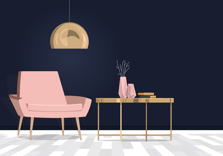
Sage green paired with creamy off-whites is a staple in many stately homes across the UK. This combination gained popularity during the Georgian and Victorian eras when natural pigments were favoured for their understated elegance. Sage evokes the rolling English countryside and garden vistas visible from manor windows, while cream softens and lifts the space, ensuring rooms feel inviting even on overcast days. This pairing is often seen in drawing rooms and libraries, creating an atmosphere of calm refinement.
Oxblood and Gold: A Touch of Drama
The deep, rich hue of oxblood red—sometimes called claret—combined with gold accents is synonymous with grandeur and heritage. Historically used in dining rooms and entrance halls, oxblood was considered a mark of opulence and hospitality. Gold leafing on picture frames, mirrors, or mouldings adds warmth and reflects candlelight, enhancing the sense of occasion during evening gatherings. The enduring appeal lies in its ability to make spaces feel both intimate and impressive.
Navy with Soft Grey: Quiet Confidence
Navy blue has long been associated with British naval tradition, symbolising reliability and composure. When partnered with gentle shades of grey, this duo offers a modern twist on classic formality. Popular in studies and bedrooms, navy provides depth without overpowering, while soft grey introduces lightness and balance. The result is a restful yet distinguished palette that feels grounded in history but perfectly suited to contemporary living.
The Stories Behind Their Popularity
These timeless pairings endure not just for their aesthetic appeal but also because they tell stories about British life—of weathered landscapes, social rituals, and the blending of old with new. Whether chosen to echo the surrounding countryside or to highlight craftsmanship within the home, such combinations serve as practical guides for anyone seeking to capture the essence of British country house style.
4. Incorporating Pattern and Texture
One of the defining characteristics of British country house style is the masterful layering of patterns and textures, which brings depth and a sense of comfort to interiors. Rather than relying solely on colour, British designers often use classic motifs—think florals, stripes, and checks—to add visual interest. These patterns are rarely bold or brash; instead, they tend to be subtle, allowing different elements to sit together harmoniously without overwhelming the space.
Classic Patterns in Country House Style
| Pattern Type | Typical Use | Common Colour Pairings |
|---|---|---|
| Floral Prints | Soft furnishings, curtains, wallpaper | Sage green & cream, rose pink & ivory |
| Stripes | Upholstery, cushions, rugs | Navy & off-white, burgundy & taupe |
| Plaid/Checks | Throws, blankets, occasional chairs | Forest green & mustard, russet & beige |
The Role of Texture
Tactile finishes are another hallmark of British interiors. Materials such as wool, linen, velvet, and even aged leather are used liberally to create a layered look that feels inviting rather than staged. Walls might feature traditional panelling or textured wallpapers; floors often showcase natural fibres like sisal or jute in rugs. This thoughtful blend of tactile surfaces contributes to the ‘lived-in yet sophisticated’ atmosphere so intrinsic to the country house aesthetic.
Tips for Achieving This Look at Home
- Mix different textures (e.g., velvet cushions on a linen sofa) for a balanced feel.
- Layer patterns by combining large-scale florals with smaller stripes or checks—stick to a cohesive colour palette for harmony.
- Add handmade elements: knitted throws, embroidered cushions, or hand-painted ceramics help reinforce authenticity.
A Note on Restraint
The key is to avoid over-cluttering; British country interiors celebrate abundance but always maintain an undercurrent of orderliness. By carefully selecting patterns and textures that complement your chosen colour scheme, you can achieve that charmingly relaxed yet refined look synonymous with the English countryside.
5. Modern Updates on Classic Combinations
British country houses are renowned for their time-honoured palettes, but adapting these classic colour schemes to modern homes can be both exciting and respectful of tradition. The secret lies in balancing heritage with a contemporary twist, ensuring the essence of British character remains intact. For example, the signature sage green and ivory pairing often seen in period drawing rooms can be revitalised by opting for a bolder, moss green contrasted with crisp white walls. This approach lends freshness without losing the calming, natural undertones that define rural elegance.
Layering Textures and Tones
A contemporary update doesn’t require discarding what works; rather, it’s about reinterpreting classics for today’s lifestyle. Consider the traditional navy and ochre duo, historically found in stately libraries or studies. In a modern flat, introduce this scheme through velvet cushions, woven throws, or accent chairs set against a lighter backdrop—perhaps a soft dove grey—to prevent the room from feeling too heavy. Layering different materials like brushed brass fixtures or linen curtains adds further depth while staying true to British sensibilities.
Unexpected Accents
Injecting subtle surprise is another way to bring classic combinations forward. Take the beloved duck egg blue and warm walnut—a staple in many country kitchens—and refresh it by incorporating pops of mustard yellow or deep plum through accessories such as lampshades, ceramics, or artwork. These accents offer a playful nod to tradition without overwhelming the space.
Real-World Example: The Updated Parlour
One notable London renovation transformed a tired parlour with a base of muted taupe walls paired with heritage-inspired floral drapery. The designer introduced modernity via sleek black picture frames and minimalist lighting, proving that you can honour British roots even while embracing clean lines and uncluttered spaces.
Ultimately, updating classic British colour combinations is about confidence—mixing old and new thoughtfully ensures your home feels both current and connected to the rich aesthetic traditions of the countryside.
6. Tips for Creating Your Own Country House Palette
Designing a country house-inspired interior in the UK today is all about blending timeless elegance with practical comfort. Here are some straightforward tips to help you choose, test, and coordinate classic British colour combinations in your home.
Start with a Heritage Base
Begin by selecting a foundational shade typical of British country houses—think soft stone, muted sage green, or gentle cream. These colours provide a serene backdrop that works beautifully with both traditional and modern furnishings.
Layer in Accent Colours Thoughtfully
Add depth by introducing accent colours inspired by nature and historical references: deep burgundy, navy blue, or mustard yellow can evoke the charm of grand manors and cosy cottages alike. Use these shades on feature walls, woodwork, or textiles to create visual interest without overwhelming the space.
Test Before You Commit
Paint swatches on different walls and observe how they look throughout the day under varying light conditions—a crucial step in Britain’s ever-changing weather. This helps ensure your chosen colours feel right year-round.
Coordinate with Texture and Material
Classic country palettes come alive when paired with natural materials. Think oak floors, linen drapes, wool throws, and brass fixtures. These textures not only complement heritage hues but also enhance warmth and authenticity.
Edit and Balance
Avoid overcrowding your palette. Stick to three or four key colours—one base, one or two accents, and a neutral—to maintain coherence. Introduce pattern sparingly through floral wallpapers or tartan cushions for a subtle nod to tradition.
Embrace Local Character
If possible, draw inspiration from your own region—whether it’s Cotswold stone, Scottish heather, or Cornish blue skies. This personal touch grounds your scheme in British culture while making your space feel truly unique.
By combining these practical steps with a keen eye for heritage detail, you can confidently craft a classic country house palette tailored to modern UK living.