Introduction to British Interior Aesthetics
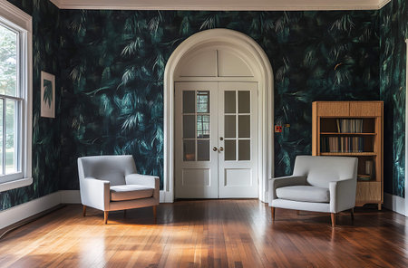
When one thinks of British interiors, an image of charmingly layered spaces often comes to mind—a celebration of heritage, comfort, and a quiet but unmistakeable sense of individuality. At the heart of this distinctive look lies a masterful approach to pattern, particularly in the realm of wallpaper. Far from being timid or overly coordinated, the quintessentially British style embraces mixing and matching wallpaper patterns, crafting rooms that feel both storied and warmly inviting. This design tradition weaves together influences from stately homes, countryside cottages, and contemporary London flats alike, offering a timeless appeal that stands apart from fleeting trends. By exploring how different prints and motifs can coexist harmoniously within a space, British interiors achieve an effortless balance between sophistication and homeliness—a testament to the nation’s rich decorative history and enduring love for characterful detail.
2. Understanding Classic British Wallpaper Motifs
When it comes to achieving a truly British aesthetic in your interiors, understanding the heritage and symbolism behind classic wallpaper motifs is crucial. Over centuries, certain patterns have become deeply embedded in the fabric of British home design, each carrying its own story and cultural resonance. Let’s explore four of the most iconic motifs—florals, stripes, damasks, and toiles—and their enduring significance within British homes.
Floral Patterns: Evoking English Gardens
Florals are arguably the most quintessentially British motif, inspired by the nation’s deep affection for gardens and countryside. From delicate wildflowers to bold botanical prints, floral wallpapers often reflect the changing seasons and rural landscapes that are central to British identity. Think of classic chintz or William Morris designs—each petal and vine tells a story of natural beauty and domestic comfort.
Stripes: Understated Elegance
Stripes bring a sense of order and refinement to British interiors. Traditionally used in stately homes and townhouses, they offer versatility—vertical stripes can make rooms feel taller, while horizontal ones add width. Their clean lines nod to the tailored suiting so beloved in British fashion, embodying an understated confidence that never goes out of style.
Damasks: A Touch of Aristocratic Grandeur
The damask motif, with its intricate symmetrical patterns often featuring foliage or floral elements, has aristocratic roots. Originally woven into luxurious fabrics for palaces and manor houses, damask wallpapers became synonymous with opulence during the Victorian era. Today, they lend depth and historical gravitas to any space, especially when paired with rich colours or metallic accents.
Toiles: Storytelling Through Design
Toile de Jouy—or simply “toile”—originated in France but found a special place in British interiors during the 18th century. Characterised by pastoral scenes or narratives printed in a single colour on a white background, toile evokes nostalgia for romanticised rural life. Its use in wallpaper allows homeowners to weave visual stories into their rooms, making it a charming choice for studies or bedrooms.
Summary Table: Key Motifs & Their Significance
| Motif | Visual Style | Cultural Significance |
|---|---|---|
| Florals | Bouquets, vines, botanical repeats | Cherished connection to nature and gardens |
| Stripes | Straight lines, varying widths/colours | Sophisticated simplicity; echoes classic tailoring |
| Damasks | Symmetrical ornate patterns | Heritage luxury; links to aristocracy |
| Toiles | Pictorial scenes in monochrome | Narrative charm; romanticised rural life |
Understanding these classic motifs not only helps you select wallpapers that resonate with British tradition but also provides a foundation for mixing and matching with confidence—ensuring your home exudes authenticity while reflecting your personal taste.

3. Choosing Complementary Patterns and Colours
When aiming to achieve a quintessentially British interior with wallpaper, the art lies in selecting patterns and colour palettes that harmonise rather than clash. The British look is renowned for its eclectic yet curated feel—think country house charm or London townhouse sophistication—where boldness is balanced by restraint. To begin, opt for classic motifs such as florals, damasks, stripes, or heritage geometrics. These time-honoured patterns have stood the test of time in British homes and can be mixed with subtlety when you keep scale and complexity in mind.
For a cohesive scheme, pair a larger, statement pattern with smaller, more understated designs. For example, a dramatic botanical print on one wall can be offset by delicate pinstripes or polka dots on another. This approach ensures visual interest without the risk of overwhelming the senses—a common pitfall when mixing multiple wallpapers.
Colour is equally crucial. The British palette often leans towards muted, earthy tones: sage green, dusty rose, ochre yellow, and soft blues evoke an inviting sense of tradition. However, it’s not unusual to see richer hues like deep navy or burgundy as accents. When combining wallpapers, choose colours that share underlying tones or belong to the same family; this creates flow from room to room or across different walls within the same space.
If you’re uncertain about introducing bolder shades, anchor your selection with neutral backgrounds—ivory, taupe or gentle greys—and let accent patterns provide character. This ensures your space feels layered and lived-in rather than chaotic.
Above all, trust your instinct but test combinations before making a final decision. Pin up samples side by side and observe them throughout the day as natural light changes; what appears harmonious in morning sunlight may feel entirely different at dusk. With patience and experimentation, you’ll discover a blend that’s distinctly British yet entirely your own.
4. Balancing Contrast and Harmony
Achieving that unmistakably British flair with wallpaper is as much about restraint as it is about bravado. The art of mixing and matching patterns relies on the careful balancing of contrast and harmony—a process that, when done thoughtfully, results in a space that feels both curated and lived-in rather than chaotic. Let’s explore some practical techniques for layering various wallpaper designs to achieve this sophisticated blend.
Understanding Visual Weight
Before diving into combinations, it helps to recognise the visual weight of different patterns. Large florals or bold geometrics naturally draw more attention, while subtle stripes or ditsy prints recede into the background. A successful British-inspired room often layers these elements, allowing statement patterns to shine without overpowering quieter motifs.
Layering Techniques
| Technique | Description | Best For |
|---|---|---|
| Feature Wall Focus | Select a dramatic pattern for one wall (such as behind a bed or sofa), then balance with softer, complementary prints or solids on adjacent walls. | Traditional parlours, bedrooms |
| Tonal Variation | Mix patterns within the same colour palette. For example, pair navy botanical prints with fine blue pinstripes for depth without discord. | Dining rooms, hallways |
| Scale Play | Combine large-scale prints with smaller, more intricate designs to avoid competition for attention and create visual rhythm. | Sitting rooms, studies |
| Unifying Motif | Choose wallpapers that share a common motif (e.g., birds or foliage) but differ in style or scale; this links disparate designs seamlessly. | Libraries, guest bedrooms |
Avoiding Visual Clutter
The secret to quintessentially British interiors is ensuring every pattern has its moment. Limit yourself to two or three different wallpaper designs per room and introduce solid-coloured trims or painted panelling between patterns to offer the eye a place to rest. This use of negative space—an often overlooked engineering principle—prevents the feeling of clutter and allows each design element to contribute meaningfully to the whole.
5. Tips for Mixing Old and New Wallpaper Styles
Creating a uniquely British interior often means finding the sweet spot between cherished tradition and modern flair. When it comes to wallpaper, blending time-honoured motifs with contemporary designs can feel daunting, but the results are well worth the effort. Here’s some practical advice to help you integrate classic patterns with fresh trends for that unmistakable modern-classic British look.
Start with a Unifying Colour Palette
To ensure harmony, select a colour palette that bridges both your traditional and contemporary wallpapers. For instance, if you adore William Morris-inspired florals, pick out one or two tones from the design and echo these shades in your more graphic, modern prints. This approach provides visual continuity even when styles differ markedly.
Balance Pattern Scale and Density
British interiors are known for their cosy yet sophisticated layers. Pair a bold, large-scale heritage damask with a smaller geometric or abstract print to keep things balanced. Avoid overwhelming the senses by ensuring at least one pattern is less dominant—think of using stripes or subtle textures as a counterpoint to busier motifs.
Embrace Architectural Features
Take cues from classic British homes: use dado rails, panelling, or picture rails to break up spaces and transition between contrasting wallpapers. For example, you might place a lively contemporary pattern above a rail and a subdued vintage repeat below, creating an intentional separation that feels organic rather than jarring.
Mix Eras Thoughtfully
Don’t be afraid to juxtapose eras—Victorian florals can sit beautifully alongside mid-century geometrics or even minimalist Scandi prints if you pay attention to cohesion. The key is restraint; limit yourself to two or three distinct styles per room so each pattern has room to breathe.
Edit and Layer Accessories
Finally, let your furnishings and decor tie everything together. Cushions in updated tartans, lampshades in Liberty-style fabrics, or framed botanical prints can act as bridges between old and new patterns on your walls. By layering thoughtfully chosen accessories, you reinforce that relaxed-yet-refined British sensibility throughout your space.
6. Finishing Touches: Accessories and Furnishings
Once your walls are adorned with a harmonious medley of wallpaper patterns, it’s time to turn your attention to the finishing touches that will truly evoke a quintessentially British ambience. Thoughtfully chosen accessories and furnishings can tie the room together, creating a lived-in, inviting space that feels both refined and welcoming. When considering furniture, opt for classic British silhouettes such as a Chesterfield sofa, a well-upholstered wingback chair, or an antique wooden sideboard. These pieces lend an air of timelessness and work beautifully alongside both bold and subtle wallpapers. For textiles, layer in cushions and throws in heritage fabrics like tweed, tartan, or floral chintz—patterns that echo or contrast your wall coverings without overwhelming them. Rugs with traditional motifs, such as Persian or Axminster designs, add warmth and visual interest underfoot.
Curating Accessories with Character
Accessories should feel collected rather than coordinated. Seek out vintage finds from local charity shops or antique fairs—brass candlesticks, cut-glass vases, and old leather-bound books all nod to British tradition. Displaying a mix of framed botanical prints, black-and-white family photographs, or whimsical art adds personality while complementing your chosen wallpapers.
The Importance of Lighting
British interiors often feature layered lighting: combine table lamps with pleated fabric shades, brass wall sconces, and even the occasional crystal chandelier for a touch of grandeur. The interplay between soft light and patterned walls brings warmth and depth to the space.
Bringing the Outdoors In
No British interior is complete without a nod to nature—consider potted ferns on window ledges, fresh-cut flowers on the mantlepiece, or botanical-themed ceramics. These details echo the natural inspirations often found in traditional wallpaper designs and breathe life into your finished room.
Ultimately, selecting accessories and furnishings is about striking a careful balance between comfort, character, and cohesion. By mixing classic British pieces with carefully curated accents, you can create a space where every element complements your chosen wallpapers—resulting in a home that feels unmistakably British and entirely your own.
7. Conclusion: Achieving Your British-Inspired Retreat
Embracing the art of mixing and matching wallpaper patterns is a truly British pursuit—one that marries tradition with personal expression. By blending florals with stripes, heritage motifs with bold geometrics, or classic damasks with whimsical prints, you pay homage to the storied interiors of British country homes while creating a space that’s unmistakably your own. The key is to experiment confidently; trust your instincts and don’t shy away from combinations that reflect your character.
Remember, the heart of British interior style lies in its charming idiosyncrasy and unapologetic individuality. It’s about layering textures, playing with colour, and telling a story through pattern. Whether your home is a Victorian terrace in London or a modern flat in Manchester, you can achieve a quintessentially British look by honouring these traditions while letting your personality shine through.
So, gather your samples, play with swatches, and let yourself be inspired by everything from English gardens to vintage book covers. There are no hard and fast rules—just guiding principles rooted in centuries of design heritage. Celebrate the beauty of imperfection, welcome a touch of eccentricity, and enjoy the process of transforming your home into a retreat that feels both classic and entirely your own.