Introduction to Modern British Colour Trends
A warm welcome into the world of contemporary British interiors, where colour is more than just a decorative choice—it’s an essential element in shaping how we live and feel within our homes. Across the UK, modern colour trends are redefining spaces from cosy flats in London to country cottages in the Cotswolds, blending comfort with a fresh sense of style. Whether it’s a bold feature wall or subtle earthy tones that echo Britain’s natural landscape, these colour schemes reflect both current tastes and the enduring spirit of British home life. In this article, we’ll explore how the latest palettes are influencing everyday living, helping homeowners create spaces that are inviting, functional, and undeniably modern.
Classic Meets Contemporary: Blending Heritage Hues
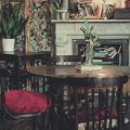
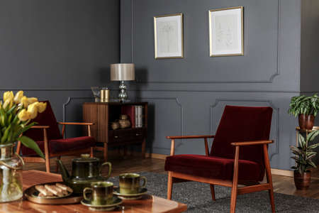
When it comes to Modern British Colour Trends, few approaches feel more rooted yet progressive than blending traditional heritage hues with a contemporary twist. British interiors have long celebrated colours like sage green and navy, both of which hold an enduring appeal thanks to their versatility and understated elegance. These shades, once mainstays of stately homes and classic townhouses, are now being cleverly refreshed for the modern British home.
The Enduring Allure of Heritage Tones
Sage green and navy sit at the heart of the British colour palette. Sage green evokes the calm of the English countryside, while navy brings a depth reminiscent of Britain’s maritime history. Their classic nature makes them perfect for those seeking comfort and familiarity in their living spaces, but their adaptability ensures they never feel dated.
How Heritage Colours Are Refreshed Today
Modern British interiors often pair these heritage tones with lighter, brighter accents or unexpected finishes. Think sage walls offset by crisp white woodwork, or navy cabinetry highlighted with brass handles. The result is a space that feels both comforting and current—perfect for today’s lifestyle-focused homes.
Popular Combinations for Contemporary Spaces
| Heritage Hue | Contemporary Pairing | Effect |
|---|---|---|
| Sage Green | Matte black fixtures, pale oak flooring | Organic calm with a modern edge |
| Navy Blue | Blush pink textiles, brushed brass details | Classic depth with warm sophistication |
This thoughtful balance between old and new allows each home to tell its own story, blending comfort and practicality with a sense of style that’s unmistakably British.
3. The Rise of Muted Neutrals
Across the UK, muted neutrals have quietly taken centre stage in contemporary homes, setting a gentle yet sophisticated tone. British interiors now favour calm shades like greige—a perfect blend of grey and beige—alongside soft taupe and gentle cream hues. These colours evoke a serene, understated elegance that feels both modern and welcoming. There’s a certain everyday luxury in these choices; they don’t demand attention but instead create a harmonious backdrop for daily life.
This trend toward muted neutrals reflects the British love for spaces that feel refined without being overly formal. Rather than opting for stark white or bold primaries, homeowners are embracing these gentle tones to foster a sense of warmth and lived-in comfort. The result is interiors that look effortlessly pulled together: think plush oatmeal sofas, pale timber flooring, and walls painted in shades that shift with the natural light.
Muted neutrals also serve as the perfect canvas for personal touches. Whether you’re displaying vintage ceramics, layering textured throws, or incorporating leafy houseplants, these colours allow your personality—and your carefully chosen possessions—to shine through without visual clutter. It’s a palette that celebrates both order and authenticity, making it easy to keep your space feeling fresh and inviting year-round.
4. Dopamine Decorating: Bold Pops and Playful Accents
In recent years, the UK has wholeheartedly embraced the concept of dopamine decorating—a trend centred around injecting joy and personality into interiors through bold colour choices. Homeowners are swapping strictly neutral palettes for playful accents, with hues like ochre yellow, blush pink, and teal making frequent appearances in otherwise understated British spaces. This approach doesn’t require a complete overhaul; instead, it’s about strategically using vibrant shades to energise rooms while maintaining that quintessentially calm and collected British feel.
Dopamine decorating is particularly well-suited to modern British homes, where subtle architectural details and classic backdrops provide the perfect canvas for experimentation. A deep teal velvet sofa in a grey living room or mustard yellow cushions against muted tones can instantly lift the mood of a space without overwhelming it. These pops of colour act like accessories—easy to update seasonally or as tastes evolve.
Popular Dopamine Colours in Modern British Homes
| Colour | Description | Common Applications |
|---|---|---|
| Ochre Yellow | Warm, earthy, and cheerful | Cushions, rugs, feature walls |
| Blush Pink | Soft, uplifting, subtly romantic | Bedding, ceramics, artwork accents |
| Teal | Rich, calming yet invigorating | Sofas, kitchen cabinets, statement chairs |
Balancing Boldness with British Sophistication
The key to successful dopamine decorating in the UK lies in restraint and thoughtful placement. Rather than saturating entire rooms with bright colours—which can feel out of place in traditional or modern British settings—homeowners opt for singular focal points. Think an ochre armchair in a reading nook or teal cabinetry contrasted by crisp white tiles. This method preserves the light-filled elegance of contemporary British interiors while introducing an element of fun.
Tips for Introducing Playful Accents at Home:
- Start small: Try colourful lampshades or vases before committing to larger pieces.
- Mix textures: Velvet cushions or ceramic accessories can enhance visual interest without clashing.
- Edit regularly: Rotate accent colours seasonally to keep the space feeling fresh and personal.
- Use colour theory: Pair bold tones with complementary neutrals (think blush pink with dove grey) for balance.
This blend of understated foundations and joyful highlights perfectly captures the evolving spirit of modern British design—embracing happiness at home while maintaining order and timelessness.
5. Earthy and Nature-Inspired Palettes
One of the most enduring modern British colour trends is the embrace of earthy, nature-inspired palettes that reflect the tranquil beauty of the UK’s landscapes. Britons have a well-known affinity for bringing the outdoors in, and this is beautifully expressed through organic shades like terracotta, moss green, and muted clay. These colours evoke the rolling hills of the countryside, ancient woodlands, and even windswept coastal paths—allowing homeowners to create interiors that feel rooted, calming, and refreshingly unpretentious.
Terracotta Tones for Cosy Living
The resurgence of terracotta is particularly notable in contemporary British homes. This warm, sun-baked shade brings a comforting glow to living spaces, whether it’s used on feature walls or as an accent through soft furnishings and ceramics. Terracotta pairs effortlessly with natural materials like oak flooring or woven baskets, adding a sense of artisanal charm that feels both modern and timeless.
Moss Green: A Nod to the British Outdoors
Moss green has become a staple in modern British colour schemes. Its soothing quality makes it ideal for bedrooms, bathrooms, or any corner where relaxation is key. Reminiscent of lush gardens and the nation’s iconic parks, moss green connects city dwellers to nature—even in urban flats with limited outdoor access. When layered with other botanically inspired tones such as sage or olive, it creates depth and a harmonious flow throughout the home.
Grounded Neutrals for Balance
Earthy palettes are often balanced with grounded neutrals—think stone greys, sandy beiges, and soft taupes. These hues keep interiors light while anchoring brighter accents, ensuring spaces remain welcoming and uncluttered. They’re perfect for open-plan living areas where continuity and calmness are desired.
This love affair with nature-inspired colour reflects a wider British appreciation for sustainability and slow living. By choosing earthy palettes, homeowners not only foster a serene environment but also create spaces that feel genuinely connected to their surroundings—embracing calm amidst the bustle of everyday life.
6. Smart Storage Solutions for Colour Harmony
In the ebb and flow of modern British life, our homes often become a canvas for both cherished belongings and daily necessities. To truly let contemporary colour schemes shine, thoughtful storage is key. Clever organisation not only declutters your space but also preserves the visual impact of your chosen palette. By integrating smart storage solutions—think built-in cabinetry painted in muted sage or navy, or sleek baskets in natural textures—you can maintain both order and aesthetic balance.
When working with trending British colours like deep forest greens, dusky pinks, or classic greys, it’s important to avoid visual noise from clutter. Closed storage, such as under-stair cupboards or minimalist wardrobes, conceals everyday items while keeping the colour story uninterrupted. For open shelves, curate your display with care: use matching containers or coordinate books and ornaments by tone for a cohesive look that complements your walls.
Busy British households benefit from multi-functional furniture too. Consider ottomans with hidden compartments or benches that double up as shoe storage—these are perfect for hallways and living rooms where every inch counts. It’s not just about hiding things away; it’s about selecting pieces that echo your colour scheme and enhance the overall harmony of your home.
Ultimately, embracing effective storage is less about achieving perfection and more about creating breathing space for both you and your décor. This allows modern British colours to take centre stage, making your home feel effortlessly pulled together—whether you’re unwinding after work or hosting friends for a Sunday roast.
7. Curating Your Own British-Inspired Palette
While it’s inspiring to explore the most current British colour trends, the true essence of a modern home lies in its personal touch. Curating your own palette allows you to take cues from the best of contemporary British style—think rich, heritage tones balanced with fresh, airy neutrals—and shape them into something uniquely yours. Start by considering how each space is used and the mood you’d like to evoke. Perhaps you’re drawn to the deep greens and bold blues found in urban townhouses, or maybe you fancy the soft sage and gentle greys reminiscent of rural cottages. Mix and match these hues thoughtfully, anchoring your scheme with a classic British base such as off-white or muted taupe, then layering in statement shades for character.
Layering with Purpose
Don’t be afraid to experiment with accents, whether through painted skirting boards, colourful cabinetry, or even a feature wall in an unexpected tone. Embrace the subtle art of contrast that defines modern British design—pair warm terracottas with crisp whites, or offset deep charcoal with blush pinks. Each choice adds depth and tells a story unique to your home.
Practical Tips for Personalisation
- Test swatches in natural light: British weather can be unpredictable; see how colours shift from morning grey to afternoon sunshine.
- Start small: Try out bolder colours on smaller elements like doors or alcoves before committing to entire rooms.
- Balance tradition and trend: Blend classic colours (like navy or moss) with on-trend pops (such as ochre or teal) for a timeless yet current feel.
Your Home, Your Story
The beauty of modern British interiors is their capacity for individuality within a framework of elegance and practicality. Let your personality shine through your choices while drawing inspiration from the best-loved palettes across the UK. This way, your home will not only look effortlessly stylish but also feel distinctly yours—a reflection of contemporary trends shaped by your everyday life.