Understanding Muted Elegance
Muted elegance is a defining characteristic of British interior design, where the understated allure of soft tones takes centre stage. Unlike the bold and vibrant palettes often found in other cultures, British homes have long embraced a gentler approach—one that values subtlety over spectacle. This concept revolves around the idea that true sophistication lies not in ostentation, but in restraint and harmony. Soft hues such as dove grey, pale sage, and dusty blush effortlessly evoke a sense of calm while adding depth and character to any room. These tones allow architectural details and textures to shine without overwhelming the senses, creating spaces that feel timelessly inviting. In the context of British interiors, muted elegance is more than just an aesthetic choice; it reflects a cultural appreciation for quiet charm, comfort, and enduring style.
2. A Brief History of Soft Tones in British Homes
The story of soft, muted tones in British interiors is deeply rooted in the nation’s architectural and cultural evolution. From the stately manors of the Georgian era to the sleek minimalism of modern flats, these gentle hues have long played a pivotal role in shaping the character and comfort of British homes.
The Georgian Influence
During the Georgian period (1714–1830), British interior design was defined by an understated elegance. Walls were often painted in pale blues, greens, and greys—colours that reflected natural light softly and created an atmosphere of refined calm. This era’s emphasis on symmetry and proportion found a perfect partner in muted palettes, which enhanced architectural details without overwhelming them.
Victorian Adaptation
The Victorian age saw a shift towards richer colours but still valued soft tones in drawing rooms and bedrooms. Pastels such as dusky rose and powder blue became popular, balancing ornate furnishings with a sense of serenity. The following table highlights key soft tones across historical periods:
| Period | Popular Soft Tones | Typical Usage |
|---|---|---|
| Georgian | Pale blue, Sage green, Light grey | Walls, Ceilings, Cornices |
| Victorian | Dusky rose, Powder blue, Cream | Bedrooms, Parlours |
| Edwardian | Mushroom, Duck egg blue, Ivory | Living spaces, Hallways |
| Modern | Muted taupe, Pebble grey, Soft blush | Kitchens, Open-plan areas |
The Edwardian Shift and Beyond
With the dawn of the Edwardian era (1901–1910), there was a notable move towards lighter interiors. Mushroom and duck egg blue complemented the growing trend for larger windows and brighter rooms. This appreciation for airy spaces has carried through to contemporary British design, where muted palettes are chosen for their timeless quality and adaptability.
Cultural Continuity and Modern Revival
British interiors today still draw inspiration from this history. The enduring popularity of soft tones speaks to their ability to create welcoming environments that stand up to ever-changing trends. Whether it’s a country cottage or a city flat, these hues offer flexibility while maintaining a connection to Britain’s rich design heritage.
3. How Soft Tones Reflect British Lifestyle and Traditions
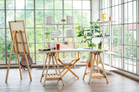
Soft, neutral colours have long been an integral part of British interiors, mirroring the nation’s unique blend of comfort and understated sophistication. The British lifestyle is marked by a preference for spaces that feel inviting yet refined—a balance effortlessly achieved through muted tones such as gentle greys, warm creams, and subtle sage greens. These hues evoke a sense of calm that complements daily rituals like afternoon tea or curling up with a good book on a rainy day, reflecting the cherished value of home as a sanctuary.
The reserved elegance often associated with British taste finds perfect expression in these soft palettes. Rather than opting for bold statements, British interiors favour layered textures and quiet colour schemes that allow personality to shine through in curated details—be it through heirloom furniture, classic woodwork, or tasteful artwork. This approach not only preserves a sense of tradition but also ensures longevity and timelessness within the home.
Furthermore, Britain’s distinctive climate and historic architecture play significant roles in shaping interior choices. Overcast skies and shifting light encourage the use of lighter, muted shades to brighten rooms and enhance natural light. Traditional Victorian terraces, Georgian townhouses, and cosy countryside cottages all benefit from the softening effect of these colours, which help to create warm, welcoming atmospheres regardless of the weather outside. In essence, soft tones in British interiors are more than just an aesthetic choice—they are a thoughtful response to the rhythms of everyday life and the enduring charm of the nation’s heritage.
Practical Benefits: Maintenance and Longevity
When considering the practical aspects of interior design, soft tones offer a range of tangible advantages that make them particularly well-suited to British homes. Their subtlety does more than simply please the eye; it also serves a functional purpose, making everyday maintenance less demanding and ensuring that living spaces remain inviting for years to come.
Concealing Minor Imperfections
One of the standout benefits of muted colours is their ability to mask minor blemishes on walls and surfaces. Whether it’s a scuff from everyday activity or slight unevenness in older properties, soft shades such as dove grey, warm taupe, or gentle sage naturally downplay these flaws. This quality is especially valued in the UK, where many homes feature period architecture with surfaces that may show signs of age.
Ease of Maintenance
The practicality of muted palettes extends to maintenance routines. Unlike darker or highly saturated hues, which can highlight dust, fingerprints, or smudges, softer colours tend to be more forgiving. Cleaning becomes less frequent and less strenuous, which is ideal for busy households or those who prefer a low-maintenance lifestyle. The table below illustrates how different tones compare in terms of upkeep:
| Tone | Visibility of Marks | Cleaning Frequency Needed |
|---|---|---|
| Soft/Mute (e.g., greys, creams) | Low | Occasional |
| Dark (e.g., navy, charcoal) | High | Frequent |
| Bright/Saturated (e.g., red, teal) | Medium-High | Regular |
Preserving Lasting Elegance
The understated charm of soft tones ensures interiors do not quickly appear dated or worn. These hues are less susceptible to fading from sunlight—a common concern given Britain’s often overcast skies interspersed with bright spells. Additionally, because they are timeless by nature, muted shades help maintain a fresh and elegant look without the need for regular repainting or redecorating.
Sustaining Value Over Time
In essence, investing in soft tones is both an aesthetic and practical decision for British interiors. They offer a resilient backdrop that withstands daily life while requiring minimal effort to keep looking smart—qualities that align perfectly with the tradition of preserving the character and value of one’s home.
5. Pairing Soft Tones with British Materials
Muted colour palettes are especially effective when paired with traditional British materials, creating a timeless yet inviting atmosphere in both period and contemporary homes. Timber, stone, and brick are cornerstones of British architecture, each bringing their own character and warmth to interiors. When soft tones like dove grey, sage green, or warm taupe are introduced alongside these materials, the result is an understated elegance that enhances rather than overwhelms the natural beauty of the textures.
For instance, exposed oak beams or parquet flooring in a Victorian terrace can be softened with gentle hues on walls and furnishings, allowing the wood’s grain and patina to shine through without clashing. In country cottages, original stone fireplaces or flagstone floors pair beautifully with muted creams or blush tones, lending a sense of calm that complements the rustic nature of these features.
Even in more modern British homes where exposed brickwork is celebrated as a design element, subtle colour palettes help highlight the depth and variation within the brick itself. By avoiding harsh contrasts and instead opting for harmonious blends, you create continuity throughout the space—one that feels cohesive and considered.
Whether you’re restoring a Georgian townhouse or updating a 1930s semi-detached property, integrating soft tones with classic materials respects the heritage of the building while also making spaces feel fresh and liveable. This approach ensures that new additions or renovations sit comfortably alongside existing features, preserving the integrity of British interiors through thoughtful design choices.
6. Personalising Soft-Elegant Spaces
Layering Textures for Comfort and Depth
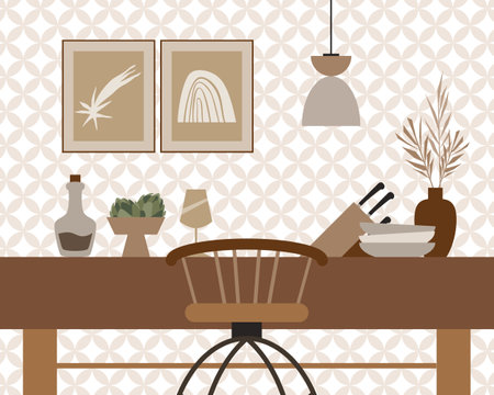
Muted interiors offer a serene canvas, but to prevent them from feeling flat or uninspired, layering textures is key. Consider combining natural fibres such as wool throws, linen cushions, and velvet upholstery to add tactile interest. In traditional British homes, these elements not only provide warmth but also reflect the country’s appreciation for comfort and heritage craftsmanship. Layering different materials encourages an inviting atmosphere that feels both lived-in and sophisticated.
Mixing Patterns with Subtlety
Soft tones do not mean you have to forgo pattern altogether. In fact, introducing subtle prints such as gentle florals, understated stripes, or classic checks can enliven a muted space while remaining true to British elegance. The secret lies in keeping patterns within a harmonious colour palette—think sage greens, dove greys, and powdery blues—to maintain cohesion. Mixing patterns in this way echoes the eclectic yet restrained charm found in many historic British interiors.
Incorporating Meaningful Décor
Personal touches make all the difference when creating a home that resonates with your character and local sensibilities. For British interiors, consider displaying family heirlooms, vintage ceramics, or art that reflects the local landscape. A hand-thrown pottery vase from Cornwall or framed prints of the Lake District can infuse your space with personal stories and a distinct sense of place. These items become focal points that anchor your muted palette while expressing individuality.
Balance Practicality with Personality
British homes are often celebrated for their practicality alongside their style. Incorporate functional elements—like woven baskets for storage or antique trays on coffee tables—that blend seamlessly into the soft-elegant backdrop. These pieces should serve everyday needs while also contributing to the room’s aesthetic harmony.
The Final Touch: Celebrate Local Craftsmanship
Finally, embrace locally made décor where possible. From handwoven rugs to bespoke lampshades crafted by British artisans, these finishing touches enrich your interior with authenticity and understated luxury. By carefully curating each layer, pattern, and decorative item, you create a space that is distinctly yours—timelessly elegant, deeply comfortable, and unmistakably British.