Introduction to Period Properties and Their Timeless Appeal
In the heart of Britain’s towns and countryside, period properties stand as enduring symbols of architectural artistry and heritage. These homes—spanning Georgian, Victorian, and Edwardian eras—are celebrated for their distinctive character, intricate detailing, and a sense of history woven into every brick and cornice. But what truly defines a ‘period property’ in the UK? Generally, this term refers to homes built before the First World War, each era reflecting unique social trends, technological advances, and design philosophies that shaped British domestic life. The Georgian era (1714–1830) is renowned for its symmetry and proportion, Victorian homes (1837–1901) for their ornate flourishes and innovation, while Edwardian architecture (1901–1914) embraces lightness and decorative simplicity.
The historical context of these periods is essential in understanding their allure today. Each era’s approach to colour was more than a matter of taste—it spoke to the values, aspirations, and advancements of society at the time. Authentic colour schemes are not just about nostalgia; they are integral to preserving the integrity of these treasured homes. Carefully chosen palettes enhance original features, respect the property’s provenance, and create interiors that feel both timeless and relevant. In an age where modern design trends come and go, period properties remind us of the enduring appeal of thoughtful craftsmanship and harmonious colour—a legacy well worth honouring in contemporary living.
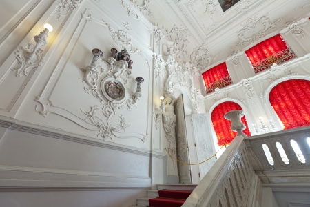
Victorian Homes: Deep Hues and Dramatic Contrasts
Victorian homes are celebrated for their opulent colour schemes and bold visual statements, making them a beloved cornerstone of Britain’s architectural heritage. The late 19th century saw an explosion of deep, saturated hues and layered palettes, reflecting both the prosperity and the adventurous spirit of the era. When considering authentic Victorian colour schemes for period properties, it’s important to draw inspiration from historic paint charts and decorative guides that highlight dramatic contrasts and moody sophistication.
Iconic Victorian Colour Palettes
Victorian interiors favoured rich colours that created a sense of warmth and grandeur. These deep tones were often paired with ornate cornicing, ceiling roses, and woodwork, all designed to showcase craftsmanship and attention to detail. Commonly used colours included:
| Colour | Description | Typical Use in Victorian Homes |
|---|---|---|
| Burgundy | A sumptuous, wine-red shade | Dining rooms, drawing rooms, feature walls |
| Deep Green | Evocative of nature, yet formal and elegant | Libraries, studies, wainscoting |
| Navy Blue | A classic navy conveying depth and luxury | Hallways, parlours, accent detailing |
Popular Paint Types in the Victorian Era
The Victorians embraced both matt and gloss finishes depending on the room’s function. Distemper paints—a chalky finish ideal for ceilings—contrasted with durable oil-based glosses used on skirting boards and doors. Flocked wallpapers and stencilled borders were also common, adding layers of texture and pattern to already rich wall colours.
Enhancing Original Architectural Features
To truly honour your Victorian property’s character, use these lush tones strategically:
- Mouldings & Cornices: Highlight plaster details with contrasting shades or subtle gold accents.
- Fireplaces: Frame cast iron or marble fireplaces with deep hues to create an inviting focal point.
- Sash Windows: Paint window frames in off-whites or muted greys to balance darker wall colours.
Bespoke Tips for Modern Living
If you wish to modernise while respecting heritage, consider using a deep hue as an accent wall rather than enveloping entire rooms. Pair these shades with contemporary furnishings in lighter neutrals to create a fresh yet timeless look that celebrates your home’s history while accommodating modern tastes.

3. Edwardian Elegance: Soft Shades and Airy Spaces
The Edwardian era, spanning from 1901 to 1910, marked a significant transition in British interior design, especially within period properties. Moving away from the heavy, opulent hues favoured in Victorian homes, Edwardian interiors embraced a lighter, more refreshing palette that still resonates with modern sensibilities. Pastel shades such as powder blue, soft sage, gentle creams, and blush pinks became the hallmark of this period. These subtle colours were chosen not only for their aesthetic appeal but also for their ability to enhance natural light—something highly valued in Edwardian architecture.
Edwardian colour schemes drew inspiration from the burgeoning Arts and Crafts movement and a renewed love of nature. Floral motifs flourished, often appearing in wallpapers and fabrics, adding a delicate charm to reception rooms and bedrooms alike. The influence of outdoor gardens was brought indoors through these patterns, complemented by painted timberwork in crisp whites or pale greens to create a sense of freshness and openness.
One of the most distinct features of Edwardian homes is their emphasis on space and airiness. High ceilings, wide hallways, and large bay windows were designed to make homes feel bright and inviting. Colour choices played a crucial role in amplifying this effect; walls painted in light tones reflected sunlight beautifully throughout the day. Decorative elements were kept simple yet refined—think understated picture rails and elegant cornicing—allowing the airy spaces and delicate colours to truly shine.
To channel authentic Edwardian elegance in your own home, consider layering soft pastels with botanical prints or textiles. Pairing these hues with natural wood floors or white-painted skirting boards will evoke the calm sophistication characteristic of early 20th-century British interiors. Whether you’re restoring an original period property or simply seeking inspiration for a fresh look, Edwardian colour schemes offer timeless appeal rooted in Britain’s rich design heritage.
Georgian Grandeur: Symmetry and Classic Neutrals
When it comes to period property colour schemes, the Georgian era stands out for its refined elegance and a disciplined approach to design. This was a period where symmetry ruled, and the palette reflected a sense of calm order—perfect for anyone seeking to restore or reinterpret a stately British home with authenticity.
The Essence of Georgian Colour Palettes
Georgian interiors are distinguished by their restrained sophistication. The colours chosen were never brash or overwhelming; instead, they favoured cool greys, muted blues, and classic off-whites. These hues provided a subtle backdrop that enhanced architectural details such as ornate cornicing, panelled doors, and sash windows. The intent was always to create a harmonious space that felt both dignified and welcoming.
Typical Georgian Colour Choices
| Colour | Description | Best Used In |
|---|---|---|
| Pale Grey | A soft, cool shade perfect for walls or woodwork, offering understated elegance. | Drawing rooms, hallways |
| Muted Blue | A gentle blue reminiscent of faded denim; calming and timeless. | Bedrooms, studies |
| Off-White (Ivory/Cream) | Classic neutrals that bounce light around the room while keeping spaces airy. | Ceilings, cornices, skirting boards |
| Sage Green | A subtle green that references Georgian gardens and brings tranquillity indoors. | Libraries, kitchens |
Symmetry in Design and Colour Placement
A defining hallmark of Georgian homes is symmetry—not only in architecture but also in colour placement. Walls were often painted in one continuous shade with mouldings picked out in crisp white or ivory for contrast. Fireplaces and window surrounds would mirror each other in arrangement and finish. This approach creates visual balance and an enduring sense of order that still resonates in contemporary British interiors.
Modern Interpretation: Staying True to the Georgian Spirit
If you’re restoring a Georgian property or wishing to channel its timeless appeal in a modern setting, opt for matte finishes over gloss to echo the original limewash effect. Layer classic neutrals with tactile fabrics—think linen drapes or woollen throws—to soften the formality without losing the period charm. Above all, maintain symmetry in your layout and let those beautifully muted shades do the talking. This restrained yet sophisticated scheme remains a favourite among homeowners who appreciate both heritage and harmony.
5. Blending Contemporary Trends with Traditional Character
Modernising a period property need not mean disregarding its heritage; instead, it’s about finding harmony between the old and the new. Many UK homeowners are embracing contemporary colour palettes while carefully preserving the architectural integrity of their Victorian, Edwardian, or Georgian homes. Here’s how to introduce current hues without losing your property’s historic charm.
Respecting Architectural Details
Start by identifying original features worth showcasing—ornate cornices, dado rails, or decorative ceiling roses are characteristic in period homes. Rather than painting over these details with bold, trendy colours, let them stand out by using muted modern shades on walls and leaving mouldings crisp in off-whites or soft creams. This subtle contrast highlights craftsmanship while keeping the space fresh.
Selecting a Contemporary UK Palette
Today’s British interiors favour serene neutrals like sage green, misty grey, and warm taupe—tones that complement classic period architecture beautifully. Consider Farrow & Ball’s “Ammonite” for a gentle backdrop in a Georgian sitting room, or Little Greene’s “Sage Green” for an Edwardian hallway. For a bolder accent, try “Hague Blue” in a Victorian dining area, balanced by lighter trim.
Practical Tips for Integration
If you wish to experiment with deeper contemporary colours, such as charcoal or navy, use them in moderation—on feature walls, alcoves, or cabinetry—so they add depth without overwhelming the historical context. Introduce modern textiles and furnishings in complementary hues to link past and present visually. Layering tactile fabrics like velvet or linen in updated shades creates a sense of understated luxury that feels right at home among traditional features.
Ultimately, blending contemporary trends with period character is about balance: honouring history through thoughtful choices while allowing your personal style—and the best of current British design—to shine through.
6. Sourcing Authentic Colours and Paints in the UK
Bringing genuine period character to your Victorian, Edwardian, or Georgian home relies on sourcing the right colours and finishes. The UK is blessed with a rich heritage of paint manufacturing, with numerous brands specialising in historically accurate palettes. Whether you’re seeking deep Georgian ochres, delicate Edwardian pastels, or bold Victorian hues, choosing the correct supplier ensures your project remains faithful to its architectural origins.
British Paint Brands for Period Properties
Several British paint brands are renowned for their dedication to heritage colour accuracy. Farrow & Ball offers carefully researched period shades inspired by historical documents and interiors. Little Greene collaborates with the National Trust to produce authentic Georgian, Regency, and Victorian collections—each shade accompanied by provenance notes. Crown Paints, with its Historic Colours range, provides another excellent resource for those restoring listed or characterful homes.
Sourcing Heritage-Inspired Wallpapers and Finishes
Beyond paint, wallpapers add depth and authenticity to period schemes. For Victorian vibrancy, look to William Morris-inspired prints from Morris & Co., while Sanderson offers timeless Edwardian florals and Georgian stripes. When selecting finishes, opt for traditional options: eggshell for woodwork, chalky matt emulsion for walls, and hand-mixed limewash for Georgian properties. Many suppliers offer sample pots and swatches so you can test how colours work within your unique space and natural light conditions.
Tips for Achieving an Authentic Look
When recreating period-accurate colour schemes, reference original features such as cornices or dado rails for clues about historic palettes. If possible, consult local conservation officers or heritage consultants who may have access to paint analysis records. Finally, always consider the age and orientation of your property—colours that suited north-facing Victorian parlours may look very different in bright Edwardian bay windows. By using reputable British brands and referencing authentic resources, you can confidently create interiors that honour your home’s history while feeling beautifully curated and liveable today.
7. Conclusion: Celebrating British Heritage Through Colour
In the tapestry of British architecture, period properties stand as proud reminders of the nation’s rich cultural heritage. The thoughtful selection of colour schemes—whether Victorian opulence, Edwardian freshness, or Georgian restraint—plays a crucial role in preserving the authentic character and inherent value of these historic homes. Contextually sensitive choices not only respect the architectural intent but also enhance the living experience, forging a meaningful connection between past and present. By honouring traditional palettes and understanding their historical significance, homeowners become stewards of heritage, ensuring that each brushstroke contributes to the ongoing story of Britain’s built environment. Ultimately, celebrating period property colour schemes is more than a design decision; it is an act of cultural appreciation, safeguarding unique identities for generations to come.