Introduction to Regional Colour Preferences
Colour is a defining element in interior design, setting the tone and mood of every space. Across the United Kingdom, the significance of colour runs deeper than mere aesthetic choice; it’s woven into the very fabric of regional identity. From the bustling metropolitan homes of London to the cosy cottages nestled in the North, cultural heritage, local climate, and historical influences all play their part in shaping how Britons perceive and use colour within their living environments. As we explore the dynamic contrasts between northern and southern interior styles, understanding these regional preferences reveals much about both the people and places that make up the UK. This journey into Britain’s colour palette highlights not only style trends but also the enduring influence of tradition and modernity on domestic life.
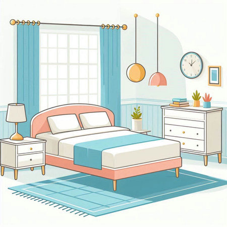
Northern England: Warmth, Comfort, and Heritage
In Northern England, interior colour preferences are deeply rooted in the region’s unique heritage and climate. The cooler, often damper weather of the North has influenced homeowners to favour palettes that exude warmth and comfort. Rich, earthy tones such as deep reds, rustic browns, forest greens, and slate blues are frequently chosen to create a cosy atmosphere within homes that may otherwise feel cold or austere. These colours not only provide visual warmth but also evoke a sense of tradition, drawing inspiration from historic stone cottages, industrial mills, and the dramatic northern landscapes.
Popular Colour Palettes in the North
| Colour Tone | Common Shades | Influences |
|---|---|---|
| Earthy Browns | Chestnut, Walnut, Taupe | Industrial heritage, local timber features |
| Deep Reds | Burgundy, Brick Red | Victorian architecture, terraced housing |
| Slate Blues & Greens | Moss Green, Slate Blue | Northern landscapes, stonework |
The Impact of History and Industry
Northern England’s history—marked by the Industrial Revolution and centuries-old rural traditions—continues to shape colour choices today. Many interiors pay homage to exposed brickwork and dark timber beams found in converted warehouses or classic terrace homes. This historical influence encourages the use of durable paint finishes and natural materials that complement these deeper hues.
A Sense of Comfort and Community
The preference for such palettes is also tied to the culture of hospitality prevalent in the North. Homes are often designed as welcoming retreats from harsh weather conditions—a place where friends and family gather around warm hearths. As such, wall colours and soft furnishings tend toward those that make spaces feel intimate and inviting rather than stark or clinical.
![]()
3. Southern England: Light, Airy, and Contemporary
In stark contrast to their northern counterparts, the interiors of Southern England radiate a sense of lightness and modernity, reflecting both the region’s milder climate and its cosmopolitan influences. Homeowners in areas such as Surrey, Sussex, and the Home Counties tend to favour palettes dominated by soft neutrals, pastel shades, and gentle blues or greens reminiscent of the southern coastline. This preference for lighter hues isn’t simply a stylistic choice; it’s also practical, amplifying natural daylight within often smaller Victorian terraces or modern flats. The southern approach leans towards a contemporary coastal aesthetic—think whitewashed walls, pale wooden floors, and clean lines that evoke the breezy atmosphere of seaside retreats like Brighton or Bournemouth. Accents of rattan, linen, and washed oak add texture without overwhelming the space, while large mirrors and glass features further enhance the airy ambiance. This look is completed with minimal clutter and an emphasis on open-plan living, catering to the fast-paced yet relaxed lifestyle typical of London commuters and southern city dwellers. In summary, Southern interiors celebrate clarity, simplicity, and a subtle nod to modern British coastal living.
4. Material Choices and Maintenance Considerations
When it comes to interior styles in the UK, regional colour preferences between the North and South significantly influence both material selection and ongoing maintenance routines. The interplay of climate, lifestyle, and traditional aesthetics creates distinct approaches to home design and care across regions.
Impact of Colour Preferences on Material Selection
Northern interiors often feature deeper hues—think navy blues, forest greens, and rich burgundies—which pair well with robust materials like oak, wool, and stone. These choices not only reflect a desire for cosiness in cooler climates but also require materials that can withstand heavier wear and the higher moisture levels typical of Northern weather. Conversely, Southern homes gravitate towards lighter colours such as soft greys, creams, and pastels. This palette aligns with an inclination for airy spaces featuring lighter woods, linen fabrics, and painted surfaces that suit milder conditions.
Material Selection by Region
| Region | Common Colours | Preferred Materials |
|---|---|---|
| North | Deep blue, green, burgundy | Oak, wool, stone |
| South | Cream, light grey, pastel blue | Pine, linen, painted wood |
Upkeep and Long-Term Care Considerations
The choice of colour and material has direct implications for daily upkeep and periodic maintenance. Darker hues in the North tend to mask minor stains or scuffs but can make dust more visible on lighter surfaces. Hard-wearing materials like stone floors or heavy wool carpets are favoured for their resilience but benefit from regular sealing or professional cleaning to prolong life.
In contrast, Southern interiors’ lighter shades may show marks more easily but foster a bright ambience requiring less artificial lighting. Surfaces such as painted wood demand periodic touch-ups or repainting to maintain their fresh appearance. Lighter fabrics also necessitate routine washing or professional cleaning to prevent discolouration from sunlight exposure.
Maintenance Tips Based on Regional Styles
| Region | Typical Maintenance Tasks | Recommended Frequency |
|---|---|---|
| North | Sealing stone floors Brushing wool carpets Dusting dark surfaces |
Annually Weekly Twice weekly |
| South | Touching up paint Washing linens Sunlight protection (curtains/blinds) |
Every 6 months Monthly Seasonally |
This regional divide demonstrates how practical considerations underpin aesthetic choices—ensuring homes not only look appealing but also stand up to everyday life in their respective climates.
5. Case Studies: Comparing Real Interior Spaces
To truly appreciate how regional colour preferences shape interiors across the UK, it is valuable to look at real-life examples from both the North and South. These case studies highlight not only the distinct palettes favoured in each region but also how local lifestyle, climate, and cultural influences guide these choices.
Homes of the North: Embracing Warmth and Comfort
Consider a Victorian terrace in Manchester. Here, homeowners often opt for deep, cosy hues such as rich forest greens, navy blues, or warming mustard yellows. Living rooms may feature dark painted panelling paired with textured soft furnishings—think wool throws and heavy curtains—to create a sense of warmth against the chillier northern climate. Kitchens in this region frequently showcase bold cabinetry, perhaps in burgundy or bottle green, contrasted with rustic wooden worktops and vintage accessories that evoke tradition and practicality.
Local Character: Mixing Old and New
Many Northern homes blend heritage with modernity. For example, exposed brick walls might be balanced with contemporary grey or teal feature walls, reflecting both industrial history and current trends. These interiors often prioritise durability and comfort, ensuring spaces remain inviting through long winters.
Southern Style: Light, Airy and Contemporary
In contrast, a family home in Surrey may display an entirely different palette. Southern interiors typically favour lighter shades—soft whites, pastel blues, sage greens—that reflect more natural sunlight and create an open, airy feel. In a London townhouse, you might find Scandinavian-inspired minimalism: whitewashed floors, pale walls, and pops of colour provided by art or cushions rather than large-scale paint choices.
Emphasis on Space and Brightness
Southern properties often make use of bi-fold doors or large windows to maximise light. Colour schemes are chosen to enhance this effect; pale greys or creams are common in living areas, while kitchens may feature gloss white units with subtle accents like blush pink tiles or copper fittings for a touch of elegance.
Reflecting Lifestyles Through Colour
These real-world examples demonstrate that while Northern interiors tend to emphasise comfort and cosiness through richer tones, Southern homes focus on brightness and spaciousness with lighter palettes. Both approaches are a testament to how regional identity and daily living needs continue to influence interior style choices throughout the UK.
6. Tips for Choosing Colours Based on Location
When selecting colours for your home in the UK, it’s essential to consider not only personal taste but also regional climate and architectural context. Here are practical tips to help homeowners and renovators make informed choices that suit both Northern and Southern environments:
Understand Your Regional Climate
Northern regions tend to experience cooler, greyer weather with less natural light. Opting for warmer shades such as ochres, deep reds, or rich greens can create a sense of comfort and warmth indoors. In contrast, the South enjoys more sunshine and milder temperatures, making lighter hues like soft whites, pale blues, or gentle greys ideal for enhancing brightness and reflecting natural light.
Respect Architectural Heritage
Many homes in the North feature sturdy Victorian terraces or stone cottages, often with smaller windows. Earthy or jewel tones complement these traditional settings, adding depth without overwhelming the space. Southern homes, frequently Edwardian or modern builds with larger glazing, lend themselves well to airy palettes and subtle pastels that echo coastal or countryside surroundings.
Balance Boldness with Practicality
If you’re drawn to bold colours—such as navy blues or forest greens—use them as accent walls or in smaller rooms to avoid overpowering your interiors. In high-traffic areas or family spaces, choose easy-to-maintain finishes that withstand daily wear while maintaining their vibrancy.
Consider External Influences
Take inspiration from your local landscape: Northern cities may encourage deeper shades mirroring moorland and industrial heritage, while Southern towns might inspire Mediterranean-style palettes reminiscent of seaside living. Always test paint samples in different lights to see how they react throughout the day.
Consult Local Experts
If in doubt, seek advice from local decorators who understand regional trends and building materials. Their experience ensures your colour choices harmonise with both your home’s character and its environment.
By keeping these factors in mind, you’ll create an interior style that feels cohesive, comfortable, and perfectly at home within your region—whether you’re north or south of the Watford Gap.
7. Conclusion: Embracing Local Identity in Interior Design
Throughout our exploration of regional colour preferences in UK interior styles, it has become clear that the North and South each possess distinctive palettes that reflect their unique histories, climates, and cultural influences. From the earthy, robust tones favoured in northern homes to the lighter, sunlit shades prominent in the South, these choices are more than mere decoration—they are expressions of local identity and pride. By recognising and celebrating these differences, homeowners can create spaces that are both personal and regionally authentic. Thoughtful colour selection not only enhances aesthetics but also connects us to our roots, reminding us of the landscapes and traditions that shape our daily lives. Whether you’re inspired by northern warmth or southern brightness, let your home reflect your story. Embrace your locality with pride, and use colour as a tool to celebrate what makes your region special.