Introduction: The British Love Affair with Colour
For centuries, the British have woven a vibrant tapestry of colour into the fabric of their homes, reflecting the evolving spirit and identity of the nation. From the stately drawing rooms of Georgian townhouses to the eclectic interiors of modern city flats, the use of colour in domestic spaces tells a compelling story about taste, tradition, and transformation. This enduring fascination with colour is more than mere decoration—it is an expression of personality, class, and cultural values that has shifted with each passing era. As we embark on a journey through time, exploring the historical evolution of colour palettes in British homes, we will uncover how societal changes, artistic movements, and even the famously unpredictable British weather have influenced the shades that adorn our walls. This exploration sets the scene for understanding not only what hues have graced British interiors, but also why these choices resonate so deeply within the national psyche.
Georgian Grandeur: Muted Elegance
The Georgian era, spanning from the early 18th to the early 19th century, marked a period of refined restraint in British interior design. The colour palettes of this epoch were inspired by the ideals of classicism and symmetry, echoing the stately proportions of Georgian architecture. Homeowners sought an atmosphere that radiated both sophistication and tranquility, resulting in the widespread use of gentle hues and subdued tones.
Classical Inspiration
Drawing influence from Ancient Greece and Rome, Georgian interiors often embraced colours reminiscent of natural stone, soft sky blues, and sage greens. These choices reflected not only aesthetic preferences but also a desire for harmony and proportion within domestic spaces. Walls were typically finished with matte paints or lime washes, contributing to the understated elegance that defined the period.
Typical Georgian Colour Palette
| Colour | Description | Common Use |
|---|---|---|
| Pale Blue | Evoking calm and serenity | Drawing rooms, bedrooms |
| Sage Green | Inspired by nature, grounding spaces | Libraries, studies |
| Dove Grey | Soft neutrality for balance | Hallways, dining rooms |
| Creamy White | Brightening effect while remaining subtle | Ceilings, cornices |
Sophisticated Charm Through Restraint
The restrained approach to colour in Georgian homes was enhanced by decorative elements such as ornate plasterwork and delicate wallpapers with muted patterns. Rather than overwhelming spaces with bold hues, the focus remained on creating a cohesive backdrop for elegant furnishings and classical detailing. This commitment to muted elegance still influences contemporary British interiors, where timeless charm is often achieved through carefully curated palettes inspired by the Georgian tradition.
3. Victorian Flourish: Bold Statements and Deep Tones
The Victorian era marked a dramatic shift in the colour palettes of British homes, driven by the twin engines of industrial innovation and imperial reach. With the advent of synthetic dyes and advances in pigment production, a far greater array of rich, saturated hues became available to households across the United Kingdom. Suddenly, deep crimsons, lush emerald greens, and opulent royal blues were no longer reserved for the aristocracy alone; these intense colours began to fill drawing rooms, dining parlours, and bedrooms alike.
Industrial Innovation Meets Interior Ambition
Before this period, natural pigments dictated a more subdued domestic palette. The Victorians, however, embraced the possibilities offered by mass-produced paints and wallpapers. This technological leap meant that even modest homes could indulge in bold wall treatments and decorative flourishes once considered extravagant. The widespread use of colours like burgundy and forest green on woodwork, ceilings, and patterned wallpaper transformed interiors into expressions of personal prosperity and modern taste.
Global Influence and Eclectic Inspiration
Britain’s expanding empire also played a vital role in shaping Victorian interiors. Imports from India, China, and the Middle East—ranging from textiles to ceramics—inspired a mélange of influences reflected in both pattern and palette. Rooms often showcased jewel tones paired with intricate motifs, creating spaces that felt at once luxurious and cosmopolitan. This global outlook fostered a sense of adventure within the home, encouraging homeowners to experiment with combinations previously unseen in British design.
A Legacy of Opulence
The result was an era defined by its love affair with drama and depth. Gilded picture frames popped against moody walls; velvet drapes pooled onto richly coloured carpets; every corner seemed curated for visual impact. The Victorian approach to colour not only redefined what was possible but also laid the groundwork for future generations to view their homes as canvases for bold self-expression—a legacy still admired in many stately British homes today.
4. Edwardian Lightness: Soft Pastels and Natural Tints
The dawn of the 20th century brought a refreshing transformation to the colour palettes within British homes, marking the elegant Edwardian era. With Queen Victoria’s passing and King Edward VII’s ascension, there was a palpable sense of optimism throughout the nation. This newfound confidence found its way into interior design, ushering in airy, lighter shades that contrasted markedly with the darker, richer tones of previous Victorian interiors.
Edwardian colour schemes gravitated towards pastels and natural tints, evoking an effortless gracefulness. Drawing inspiration from nature and the burgeoning Arts and Crafts movement, homeowners embraced hues such as duck egg blue, primrose yellow, delicate sage, and soft blush pink. These colours reflected an aspiration for light-filled, healthy living spaces—an antidote to the heavy drapery and ornate patterns that had dominated before.
Key Characteristics of Edwardian Colour Palettes
| Characteristic | Description |
|---|---|
| Palette Focus | Soft pastels and gentle neutrals inspired by natural elements |
| Common Shades | Powder blue, pale green, ivory, lilac, muted golds |
| Influences | Arts and Crafts movement, garden landscapes, botanical motifs |
| Mood Created | Airy, fresh, elegant; designed to maximise daylight and create a sense of space |
Materials and Textures Complementing Edwardian Colours
The palette was further enhanced by the use of lighter woods like oak or ash, delicate floral wallpapers, and painted furniture. Glass panels and white-painted cornices provided architectural accents that bounced natural light around rooms. The interplay between colour and materiality allowed spaces to feel both sophisticated and inviting—hallmarks of Edwardian domestic life.
Legacy in Modern British Homes
Today, Edwardian-inspired palettes continue to influence British interiors. Their timeless appeal lies in their ability to make spaces feel brighter and more open while retaining a subtle nod to history. Soft pastels remain a popular choice for creating tranquil retreats within contemporary homes across the UK.
5. Mid-Century and Modernist Minimalism
The mid-20th century signalled a dramatic shift in British interior colour palettes, as the nation emerged from the shadows of war and austerity. Embracing modernist ideals, designers and homeowners alike gravitated toward understated hues that reflected both optimism and practicality. Soft greys, muted blues, olive greens, and gentle creams became the bedrock of domestic colour schemes, echoing the minimalist philosophies introduced by continental architects like Le Corbusier and the Bauhaus movement.
This era was marked by a celebration of functional aesthetics—spaces were designed to be lived in with comfort and ease, avoiding excessive ornamentation. British homes began to favour open-plan layouts, clean lines, and practical furnishings, allowing colour to serve as a subtle backdrop rather than the main protagonist. Mid-century palettes often incorporated accent tones—mustard yellows or burnt oranges—applied sparingly to enliven otherwise restrained environments.
The post-war years also saw an influx of new materials such as plywood, Formica, and stainless steel, which harmonised beautifully with these soft colourways. The focus was on lightness and airiness: pale walls reflected natural light into every nook, while simple textiles in block colours further reinforced the sense of order and calm. In this way, British interiors captured the spirit of renewal while honouring a quintessentially understated national character.
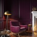
6. Contemporary Revival: Eclecticism and Heritage Reimagined
Today, British homes stand as vibrant testaments to the enduring dialogue between past and present, where historical palettes are celebrated yet unapologetically reinvented. The resurgence of eclecticism is unmistakable; homeowners and designers alike are fearlessly blending deep Victorian teals with playful mid-century oranges, or juxtaposing Edwardian sage greens against bold contemporary accents like ochre and inky blue. This modern approach is less about strict adherence to a single era, and more about curating a visual narrative that honours heritage while embracing personal expression.
British interiors now frequently feature a patchwork of influences—think Georgian cornflower blues paired with sleek metallic finishes or Arts & Crafts-inspired wallpapers enlivened by unexpected pops of neon. The popular use of period-appropriate paint brands such as Farrow & Ball or Little Greene ensures authenticity, while the layering of modern art and tactile materials adds an unmistakably current twist.
This reinterpretation is also evident in the layout and usage of space. Open-plan living, once alien to British homes, is now routinely softened by classic wall colours or heritage-inspired panelling, grounding new architectural interventions in tradition. Even in compact London flats, there’s a renewed appreciation for the warmth and depth that historical colour brings—whether through a jewel-toned feature wall or restored original woodwork in rich mahogany hues.
Ultimately, contemporary British homes celebrate colour as both memory and reinvention. By weaving together old-world charm with bold innovation, today’s interiors not only pay homage to their colourful legacy but ensure it continues to evolve—vividly, stylishly, and entirely on their own terms.