Understanding Accent Colours in British Interiors
In the realm of UK interior design, accent colours have long played a vital role in shaping the mood and character of living spaces. Unlike their use in other countries, where bold contrasts may dominate, British homes often employ accent hues with a sense of restraint and heritage—reflecting both historical influences and a national preference for understated elegance. These colours are not merely decorative; they serve as intentional focal points that guide the eye and punctuate otherwise muted palettes traditionally found in British interiors. From Georgian drawing rooms accented with deep greens or rich burgundies, to contemporary flats featuring pops of mustard yellow or teal against greys and creams, accent colours here are steeped in cultural meaning. They provide a subtle means of personal expression while respecting the architectural bones and period features so valued in UK homes. International trends may chase vibrancy or maximalism, but in Britain, accent colours are carefully curated to enhance harmony, pay homage to local design traditions, and create inviting yet distinctive living environments.
2. The Psychological Impact of Accent Colours
Accent colours possess a unique ability to shape the psychological atmosphere of living spaces, especially within the context of British homes where tradition meets contemporary design. Carefully selected accent hues do more than just catch the eye; they subtly influence mood, perception, and even social interaction. For instance, a pop of mustard yellow on a cushion or an emerald green lampshade can instantly lift spirits during the grey British winters, while also reflecting the UK’s appreciation for both vibrancy and restraint. Understanding these effects is key to creating inviting and harmonious interiors that feel distinctly British.
The Mood-Altering Power of Colour
Each accent colour carries its own emotional weight, often shaped by cultural associations prevalent across England, Scotland, Wales, and Northern Ireland. In the UK, muted earth tones such as sage green or deep navy are frequently chosen for their calming qualities—echoing the tranquil countryside or stormy coastal scenes. Conversely, bold reds or regal purples are used sparingly to evoke energy and sophistication without overwhelming the space.
Common Accent Colours and Their Psychological Effects in UK Interiors
| Colour | Psychological Effect | UK Cultural Reference |
|---|---|---|
| Mustard Yellow | Energising, uplifting | Nods to heritage textiles like tartan & cheerful cottage style |
| Sage Green | Calming, restorative | Reflects rolling hills and traditional gardens |
| Navy Blue | Soothing, trustworthy | Evokes nautical history & classic British tailoring |
| Burgundy Red | Luxurious, stimulating | Reminiscent of stately homes & festive traditions |
Cultural Nuances in Colour Selection Across the UK
The preference for certain accent colours can also vary regionally. Scottish homes may incorporate heather-inspired purples and greens, while Welsh interiors might favour slate greys with pops of daffodil yellow—a nod to local landscapes and national symbols. London flats often embrace contemporary palettes with daring splashes of orange or teal to inject personality into compact urban spaces.
Ultimately, integrating accent colours with psychological intent not only personalises a space but also fosters emotional well-being. By referencing local culture and tradition alongside individual taste, UK homeowners can transform ordinary rooms into welcoming sanctuaries that nurture both body and mind.
3. Creating Focal Points: The Role of Accent Colours
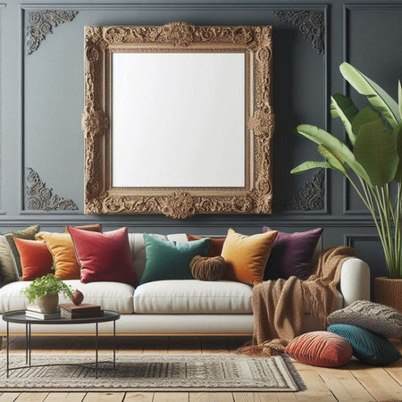
In many British living rooms, the use of accent colours is a tried-and-tested strategy for crafting visual interest and guiding the eye to specific features within a space. By thoughtfully introducing standout elements, homeowners can elevate an otherwise neutral or understated setting, infusing it with personality and warmth that feels distinctly British. One of the most accessible techniques involves selecting cushions in bold hues or playful patterns—think ochre yellows, forest greens, or deep navy blues—which pop against classic grey or beige sofas often found in UK homes. These soft furnishings not only serve as comfortable additions but also act as dynamic focal points that can be easily updated with the seasons or changing tastes.
Artwork is another quintessential way Britons add vibrancy and character to their living rooms. Whether it’s a framed print by a local artist, vintage railway posters, or even family photographs in colourful frames, these pieces draw attention and tell stories unique to each household. Decorative objects—such as glass vases in jewel tones, ceramic figurines from a favourite Cornish potter, or even a bold lampshade—contribute further layers of visual intrigue. The key is moderation: too many accents can overwhelm the senses, but a curated selection ensures each item stands out and complements the overall palette. Through these techniques, accent colours become more than just aesthetic choices; they reflect personal heritage and create inviting spaces where every detail feels intentional and rooted in British domestic culture.
4. Balancing Heritage and Contemporary Style
When it comes to accent colours in UK living spaces, achieving a harmonious balance between heritage architecture and contemporary interiors is key. British homes often boast distinct architectural features—think ornate Victorian cornices, the elegant symmetry of Georgian windows, or the sleek lines of modern open-plan layouts. Each of these elements brings its own character, and accent colours must be thoughtfully chosen to respect their unique textures while injecting a fresh sense of style.
For example, pairing a bold teal or mustard yellow with original Victorian cornicing can draw the eye upwards, highlighting period detail without overwhelming the space. In contrast, the understated geometry of Georgian sash windows might benefit from softer accent hues—sage greens or dusky pinks—that complement their refined proportions. Meanwhile, in contemporary open-plan settings, accent colours can demarcate zones or add visual rhythm to wide expanses, using deep blues or vibrant corals to inject personality and warmth.
How Accent Colours Interact with British Architectural Features
| Architectural Feature | Recommended Accent Colour | Effect Achieved |
|---|---|---|
| Victorian Cornices | Deep Teal, Mustard Yellow | Enhances decorative mouldings; creates dramatic focal points |
| Georgian Windows | Sage Green, Dusky Pink | Adds subtle sophistication; maintains period charm |
| Modern Open-Plan Layouts | Navy Blue, Coral Red | Defines zones; energises large spaces with contemporary flair |
This interplay between colour and texture is not just about aesthetics—it’s about creating a dialogue between old and new. When curated with care, accent colours act as a bridge: they honour Britain’s architectural legacy while allowing homeowners to express individuality and embrace modern design sensibilities. The result is a living space that feels rooted in history yet unmistakably current—a hallmark of quintessentially British interiors.
5. Seasonal Shifts and Local Influences
One of the most charming aspects of interior design in the UK is the tradition of adapting accent colours to mirror the changing seasons or to capture the spirit of a particular region. This approach not only keeps living spaces feeling fresh and dynamic, but also anchors interiors firmly within British cultural rhythms. For example, many homes in the Cotswolds—famed for their honey-toned stone cottages and rolling hills—draw upon soft sage greens, buttery yellows, and gentle creams as accent colours during spring and summer, subtly echoing the landscape outside. In contrast, come autumn, deeper russets and muted plums often make an appearance, reflecting the turning leaves and moody countryside vistas.
Similarly, interiors inspired by the Scottish Highlands frequently incorporate rich heathers, mossy greens, and deep blues to evoke misty glens and lochs. These colour choices aren’t arbitrary; they serve as a bridge between the home and its wider environment, connecting daily life to local heritage and seasonal changes. Swapping out accent cushions, throws, or decorative ceramics is a simple yet effective way that British homeowners mark these transitions, making rooms feel both rooted and renewed throughout the year.
6. Practical Tips for Introducing Accent Colours
Embracing accent colours in your UK living space can feel daunting, but with a few practical tips and a nod to British style, you can easily create focal points that feel both curated and comfortable. Start by sourcing pieces from renowned British design brands such as Habitat, Heal’s, or Made.com, which offer a spectrum of on-trend hues and classic palettes. For more accessible options, high street favourites like John Lewis, Marks & Spencer, and even Dunelm provide cushions, throws, and ceramics perfect for adding pops of colour without overwhelming your space.
Placement Matters: Where to Add Your Accents
The key to effective accent colour placement is subtlety and intention. Consider layering bold scatter cushions on a neutral sofa or introducing a vibrant rug beneath a coffee table. In British homes where natural light may be limited, strategically placing accent lamps or vases in jewel tones can lift the mood. Don’t overlook architectural features—alcoves, fireplaces, or window seats are quintessentially British spots ideal for colourful highlights.
Mixing and Matching: Keeping it Cohesive
When mixing accent colours, select two or three complementary shades inspired by a favourite artwork or patterned fabric—a much-loved Liberty print cushion or Orla Kiely throw is an excellent starting point. Avoid common styling pitfalls by keeping the base palette muted (think Farrow & Ball neutrals) and letting your accents do the talking. British interiors often favour layered textures; velvet, wool, and ceramic all take colour beautifully without feeling garish.
Avoiding Common Mistakes
One of the most frequent mistakes is overloading a room with too many competing hues, resulting in visual clutter rather than cohesion. Stick to the 60-30-10 rule: 60% dominant base shade, 30% secondary colour, and 10% accent. Resist the temptation to match everything—contrast brings character and depth typical of British interiors. Lastly, refresh your accents seasonally; swapping out ochre cushions for deep teal or blush pink keeps things current and welcoming year-round.