Introduction to Colour Psychology in British Interiors
Colour is far more than a decorative choice within British homes—it holds the transformative power to shape mood, behaviour, and atmosphere. The psychology of colour delves into how different hues can evoke feelings of warmth, calm, energy, or sophistication, making it a cornerstone of interior design both in traditional and contemporary British living spaces. From the cosy, muted palettes of classic Georgian townhouses to the bold, expressive tones found in modern London flats, colour reflects not only personal taste but also cultural heritage and social trends. In British interiors, the selection of paint colours and textiles often goes beyond aesthetics; it becomes a subtle language that communicates comfort, hospitality, and even status. As we explore the impact of colour on emotional wellbeing and daily life, we’ll discover how mindful choices can turn ordinary rooms into inviting sanctuaries or vibrant hubs for family and friends—shaping experiences one shade at a time.
Historic and Cultural Influences on Colour Preferences
The legacy of British interior design is a vivid tapestry woven from centuries of shifting tastes and societal influences. From the opulent drawing rooms of the Georgian era to the sleek, compact spaces of today’s city flats, colour preferences in UK homes have always reflected deeper cultural and historical currents. Understanding this heritage reveals why certain hues resonate so deeply within British homes and how the nation’s unique palette continues to evolve.
Georgian Grandeur: The Age of Subtle Sophistication
The Georgian period (1714–1837) set a tone for refined elegance, with interiors often bathed in muted, harmonious colours. Soft blues, sage greens, and delicate creams were popular choices—reflecting both advances in pigment technology and the influence of classical art. These shades created serene backdrops for ornate plasterwork and gilded mirrors, embodying ideals of order and restraint.
Victorian Richness: Deep Hues for Dramatic Effect
The Victorian era brought a shift towards richer, more saturated colours. Aubergine purples, forest greens, and crimson reds dominated parlours and studies, often paired with heavy drapes and dark wood furniture. This preference was partly a display of wealth and partly an embrace of cosiness—a hallmark of British culture known as “hygge” long before it became fashionable elsewhere.
Modern Flats: Light, Space, and Urbanity
In contemporary British flats, there is a noticeable return to lighter palettes. Chalky whites, soft greys, and gentle pastels are favoured for their ability to enhance natural light and create an illusion of space—essential in many urban settings. Yet, even these modern schemes retain nods to heritage through accent colours or traditional patterns.
Cultural Values Shaping Colour Choices
British colour preferences are also shaped by climate, landscape, and cultural values. The famously changeable weather encourages interiors that feel warm and inviting. National pride in heritage leads many homeowners to incorporate classic hues or period-appropriate shades, even within contemporary designs. The table below illustrates how historical periods continue to influence modern palettes:
| Historical Era | Signature Colours | Modern Adaptation |
|---|---|---|
| Georgian | Pale blue, sage green, cream | Pastel feature walls, elegant trims |
| Victorian | Burgundy, bottle green, gold accents | Dramatic accent walls, velvet furnishings |
| Mid-century Modern | Mustard yellow, teal, burnt orange | Retro accessories, statement pieces |
| Contemporary Urban | Soft grey, blush pink, navy blue | Minimalist spaces with bold accents |
This ongoing dialogue between past and present ensures that colour psychology in British homes is never static but always rooted in a rich sense of place and tradition.
3. The Emotional Impact of Popular British Colours
In the context of British homes, colour is more than just a decorative choice—it’s an emotional language that shapes daily life. A distinctly British palette often favours muted blues, sage greens, and warm neutrals, each playing a unique psychological role within living spaces.
Muted Blues: A Breath of Tranquillity
Soft, misty blues are a beloved staple in UK interiors, reminiscent of coastal skies and the gentle hues of Cornish seascapes. Psychologically, these blues evoke calmness and clarity, making them ideal for bedrooms and bathrooms where serenity is sought after. Their understated nature allows natural light to dance subtly across walls, bringing an airy, restful quality that’s particularly appreciated during long British winters.
Sage Greens: Connecting with Nature
The popularity of sage green in British homes speaks to a collective yearning for connection with the countryside. This gentle hue symbolises renewal and balance, drawing inspiration from lush gardens and rolling hills. In psychological terms, sage green fosters relaxation and focus—perfect for living rooms or studies. Its earthy undertones work harmoniously with period features or modern minimalist designs, grounding a space while inviting in the outside world.
Warm Neutrals: Cosy Yet Sophisticated
Warm neutrals—think oatmeal, taupe, and soft greys—form the backbone of many British interiors. These shades create an inviting backdrop that promotes comfort and sociability without overwhelming the senses. Warm neutrals are especially effective at absorbing and reflecting the ever-changing British daylight, providing a sense of warmth even on grey days. They offer versatility: pairing effortlessly with both heritage patterns and contemporary accents.
Setting Mood and Atmosphere
Together, these colours not only define the aesthetic of British homes but also directly influence mood. Muted blues encourage mindfulness and peace; sage greens nurture a restorative atmosphere; warm neutrals envelop spaces in subtle sophistication. Through careful selection and layering of these hues, homeowners can craft environments that soothe, invigorate, or inspire—tailoring each room’s ambiance to their needs.
4. Room-by-Room Colour Strategies
Choosing the right colours for each room in a British home is both an art and a science. The interplay between light, architecture, and daily rituals makes every space unique—requiring thoughtful consideration to evoke the right mood and enhance its function. By referencing classic British interiors, from snug lounges to sun-drenched conservatories, you can harness colour psychology to create harmonious, inviting spaces.
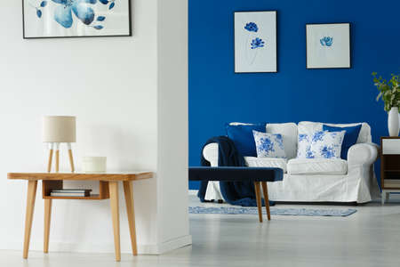
Lounge: Cosy Retreats with Warmth and Tradition
The British lounge, often the heart of the home, thrives on comfort and conviviality. Rich, warm tones such as deep navy, forest green, or even heritage reds conjure a sense of tradition and cosiness—ideal for curling up with a cuppa on a rainy afternoon. Layering these hues with neutral creams or soft greys reflects the classic look of Edwardian and Victorian sitting rooms while making modern living spaces feel welcoming.
Kitchen: Freshness and Functionality
Kitchens are lively hubs where families gather and guests mingle. Opt for uplifting shades like sage green or duck egg blue, reminiscent of rolling English countryside or seaside holidays in Cornwall. These colours foster energy and cleanliness, enhancing functionality without overwhelming the senses. White accents help maintain brightness during those famously grey British winters.
Bedroom: Tranquil Havens
For restful sleep and relaxation, British bedrooms often favour gentle pastels—think soft blush pinks, powder blues, or muted lavenders inspired by Cotswold wildflowers. These calming tones work beautifully alongside classic white bedding and wooden accents, echoing the understated luxury of boutique country inns.
Bathroom: Light and Invigorating
Bathrooms benefit from crisp, clean palettes. Cool tones like pale aqua or light grey evoke the serenity of Lake District mornings. Pair these with natural stone textures or heritage tiles for timeless appeal that feels both invigorating and restorative.
Dining Room: Sociable Elegance
Dining rooms in British homes often balance sophistication with warmth. Deep plum or charcoal grey walls paired with rich wood furniture set an elegant stage for dinner parties and Sunday roasts alike. Metallic accents—such as brass candlesticks or copper pendant lights—add a touch of opulence without excess.
Conservatory: Airy Escapes
The beloved conservatory is all about maximising natural light. Choose airy whites, soft greens, or delicate yellows to blur the boundary between indoors and out—recalling springtime gardens in full bloom. Wicker furnishings and botanical prints amplify this connection to nature.
Room-by-Room Colour Reference Guide
| Room | Suggested Colours | Mood/Function Enhanced | British Inspiration |
|---|---|---|---|
| Lounge | Navy, Forest Green, Heritage Red | Cosiness & Tradition | Classic Sitting Rooms |
| Kitchen | Sage Green, Duck Egg Blue, White | Freshness & Energy | Countryside Kitchens |
| Bedroom | Blush Pink, Powder Blue, Lavender | Calm & Relaxation | Boutique Country Inns |
| Bathroom | Pale Aqua, Light Grey | Cleansing & Serenity | Lakeside Retreats |
| Dining Room | Plum, Charcoal Grey, Metallic Accents | Sociability & Elegance | Supper Clubs & Formal Dining Rooms |
| Conservatory | White, Soft Green, Yellow | Breeziness & Connection to Nature | Cottage Gardens & Greenhouses |
This tailored approach ensures every corner of your home not only looks beautiful but also feels right for its purpose—celebrating both your personal taste and quintessentially British design sensibilities.
5. Balancing Heritage with Modern Trends
One of the most captivating aspects of British interior design is its ability to honour the past while embracing the present. Traditional colour palettes, often inspired by stately homes and countryside manors, typically feature muted greens, deep burgundies, and classic navy blues—shades that evoke a sense of history and continuity. Yet, contemporary British homes are increasingly blending these heritage hues with modern influences, creating spaces that feel both timeless and fresh.
For example, Farrow & Ball’s beloved “Railings”—a rich blue-black—draws on historic roots but finds new life when paired with crisp white trim or bold metallic accents. Similarly, sage green, once reserved for drawing rooms in Georgian houses, now graces sleek kitchens and minimalist lounges, demonstrating how a traditional shade can be transformed through context and styling. This approach allows homeowners to reference Britain’s architectural legacy while keeping their spaces relevant and inviting.
High street brands like John Lewis and Habitat have made this fusion accessible by offering collections where classic British tones meet Scandinavian simplicity or mid-century forms. In practice, you might see a Chesterfield sofa upholstered in blush velvet set against a backdrop of soft grey walls—an interplay between vintage comfort and modern restraint. Layering different eras through colour not only reflects Britain’s eclectic design history but also caters to evolving tastes and lifestyles.
Ultimately, balancing heritage with modernity is about thoughtful curation: selecting colours with provenance and updating them through texture, finish, or unexpected combinations. This creates an atmosphere that feels grounded yet forward-looking—a hallmark of contemporary British interiors shaped by psychology as much as style.
6. Tips for Creating Atmosphere Using Colour in British Homes
Crafting the perfect mood in a British home goes beyond simply choosing a paint colour; it’s about layering textures, finishes, and thoughtfully curated décor that resonates with both heritage and contemporary living. Here are some actionable strategies to help you harness the psychology of colour while celebrating British design sensibilities.
Choose Paint Finishes Thoughtfully
The finish of your paint is just as important as the hue itself. For traditional Victorian terraces or Georgian townhouses, consider using matte or eggshell finishes on walls for a soft, timeless look that diffuses light gently. High-gloss accents on skirting boards or doors can inject a subtle sense of drama and sophistication, while mid-sheen options like satinwood bridge classic and modern aesthetics effortlessly.
Layer with Textiles for Depth and Warmth
British interiors excel at creating inviting spaces through layers of textiles—think woollen throws, velvet cushions, and hand-tufted rugs. These tactile elements not only add comfort but also allow you to introduce accent colours without overwhelming the room. Plaids, tweeds, and florals echo local traditions and bring a sense of place, especially when paired with neutral or muted walls.
Integrate British-Made Furnishings
Embrace the craftsmanship of British-made furnishings to anchor your colour scheme. Oak sideboards from Yorkshire, Harris Tweed armchairs, or contemporary ceramics by local artisans offer authenticity and lasting appeal. Choose pieces that complement your chosen palette—whether it’s rich forest greens inspired by the countryside or deep blues reminiscent of coastal scenes—to achieve a cohesive and harmonious effect.
Balance Boldness with Restraint
If you’re drawn to vibrant hues like mustard yellow or peacock blue, use them judiciously as feature walls or in statement pieces such as lampshades or art frames. This approach reflects the understated elegance often found in British homes, where pops of colour enliven spaces without overpowering them.
Create Flow Between Rooms
To foster harmony throughout your home, opt for a consistent undertone across different rooms—be it warm greys or cool sages—and link spaces with repeating accent shades. This technique creates visual continuity while allowing each area its own personality.
By blending thoughtful paint choices, layered textiles, and authentic British furnishings, you can curate an atmosphere that not only enhances daily living but also pays homage to Britain’s unique design heritage. The result is a home that feels both deeply personal and beautifully connected to its cultural roots.