Introduction: The Unpredictable British Weather
When it comes to life in the UK, one thing is certain: you can never quite predict what the weather will do next. Whether it’s waking up to sunshine and finding yourself caught in a sudden downpour by lunchtime, or experiencing four seasons in a single day, the famously changeable British climate is woven into the fabric of daily living. This ever-shifting weather doesn’t just influence our wardrobes or weekend plans—it quietly shapes how we think about our homes too. With grey skies and drizzle often dominating the forecast, many people across Britain find themselves seeking ways to bring comfort, warmth, and brightness indoors. It’s no wonder that interior colour choices are so often guided by the need to counterbalance the moodiness outside, creating spaces that feel uplifting and inviting whatever the weather may be doing beyond our windows.
2. The Connection Between Light Quality and Colour Atmosphere
British weather is famously unpredictable, often characterised by subdued daylight and a prevalence of overcast skies. This unique light quality plays a pivotal role in shaping how colours are perceived within UK homes. Unlike the intense sunlight found in more southerly climates, British natural light tends to be softer and cooler, casting subtle blue-grey tones across interiors. This affects not only how colours appear but also the overall mood they create within a space.
To understand this relationship, it helps to consider how different types of daylight interact with common interior paint choices. In the UK, rooms with north-facing windows receive even less direct sunlight, amplifying the effect of cool and muted light. As a result, warm-toned hues such as creams, soft yellows, and gentle blushes are frequently chosen to counteract the chilliness and bring warmth to living spaces. Conversely, bold or bright colours may appear stark or overwhelming under grey skies, which can discourage their use in large quantities.
| Lighting Condition | Common Perception | Popular Colour Choices |
|---|---|---|
| Overcast / Cloudy | Cooler, muted atmosphere | Warm neutrals, earth tones, soft pastels |
| Bright Sunlight (rare) | Crisper colours, higher contrast | Bolder shades used sparingly |
| Dusk / Low Light | Softer edges, deeper shadows | Pale colours to maximise brightness |
The interplay between natural light and colour selection is central to British interior design sensibilities. Homeowners often choose palettes that enhance the sense of comfort and cosiness—what locals might call “cosy”—especially during long winters when daylight is at a premium. It’s not just about making a room look brighter; it’s about cultivating an inviting atmosphere that feels lived-in and practical all year round.
![]()
3. Traditional British Colour Schemes Inspired by Nature
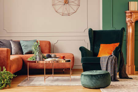
When considering how the famously changeable British weather shapes our choices in home décor, it’s impossible to ignore the enduring influence of the UK’s natural landscapes. Classic interior palettes often mirror the muted greens of rolling hills, the earthy browns of woodland floors, and the soft, misty greys that regularly blanket both countryside and city alike. These colours aren’t merely a nod to tradition—they’re a practical response to days when sunlight is scarce and skies are more pewter than blue.
Drawing inspiration from nature allows for interiors that feel timeless yet deeply rooted in their environment. Muted green walls can evoke a sense of calm and connection to the lush fields visible through rain-speckled windows. Earthy tones—think warm taupes, deep ochres, and gentle clays—bring a subtle cosiness reminiscent of autumn walks through ancient forests or the comforting embrace of an old stone cottage after a storm.
Coastal blues and soft greys play their part too, especially in homes that long for brightness during overcast months. Whether it’s the pale blue of a Cornish sky peeking through clouds, or the silvery grey of wet pebbles along a Scottish shoreline, these shades lend a lightness and airiness that counterbalance dreary days. Layering these hues with tactile materials like wool throws or linen cushions further enhances the inviting, lived-in feeling so characteristic of British interiors.
By drawing from the palette offered by Britain’s ever-present weather and natural scenery, homeowners can create spaces that not only look beautiful year-round but also feel inherently “right” for their setting—reflecting a uniquely British blend of elegance and practicality.
4. Seasonal Shifts: Adapting Interiors to Weather Patterns
Living in Britain means becoming intimately acquainted with the ever-changing weather, and this relationship deeply influences how we approach our home interiors. The distinct British seasons, each with its own quirks and moods, call for different strategies when it comes to colour choices. Many homeowners find themselves instinctively adapting their décor to complement the season’s light – or lack thereof – making use of bolder hues during the long, dark winter months and embracing lighter shades as spring and summer bring brighter days.
This thoughtful approach is more than just aesthetic; it’s about creating a space that feels uplifting and practical throughout the year. In winter, when daylight hours are limited and skies often grey, richer tones like deep blues, forest greens, and warm ochres can make rooms feel cosier and more inviting. In contrast, as sunlight increases through spring and summer, there’s a natural shift towards lighter palettes – think soft pastels, gentle creams, or fresh whites – which help reflect available light and evoke an airy atmosphere.
| Season | Typical Weather | Recommended Colour Palette | Effect on Interior Mood |
|---|---|---|---|
| Winter | Short days, overcast skies | Deep blues, rich greens, mustard yellows | Cosy, warm, intimate |
| Spring | Milder temperatures, increasing sunlight | Pale pinks, sage green, sky blue | Fresh, uplifting, hopeful |
| Summer | Longer days, occasional heatwaves | Crisp white, light grey, pastel tones | Airy, spacious, brightening |
| Autumn | Crisper air, golden afternoons | Terracotta, burnt orange, olive green | Earthy, grounding, comforting |
This seasonal adaptation isn’t about a complete overhaul but rather small changes that keep your living space feeling harmonious with the world outside. Swapping cushion covers for deeper or lighter fabrics, changing up throws or rugs to match the mood of the season, or even rotating artwork and accessories can subtly transform a room without major effort. This flexible mindset reflects a uniquely British ability to embrace the weather’s unpredictability while ensuring homes remain welcoming year-round.
5. Coping with Gloom: Creating Warmth Amidst the Grey
Let’s face it—British weather is famous for its unpredictability, and those long stretches of drizzle and overcast skies can leave homes feeling a bit lacklustre. But rather than resigning ourselves to the gloom, there are clever ways to use colour to bring a sense of warmth and cosiness into our living spaces. The secret lies in choosing hues and accents that counteract the grey, helping us create interiors that feel welcoming no matter what’s happening outside.
Choosing Inviting Base Colours
Start with your walls and larger surfaces. Creamy whites, soft taupes, and muted yellows work wonders in reflecting what little natural light we have during those cloudy days. These shades provide a gentle backdrop that feels warmer than stark white, instantly making a room feel less cold. For north-facing rooms that receive even less sunlight, consider blush pinks or subtle apricots—they add a delicate glow without overwhelming the space.
Layering Textures and Tones
To truly banish the chill, layering becomes essential. Think about adding textiles in deep ochres, burnt oranges, or rich olive greens. Cushions, throws, and rugs in these tones not only introduce visual warmth but also invite you to snuggle up when it’s grey outside. Mixing textures like wool, velvet, and chunky knits enhances this effect further, creating an environment that feels tactile and comforting.
Accents That Brighten the Mood
Don’t underestimate the power of small details. Scatter cheerful accessories—ceramic vases in mustard yellow or teal blue, artwork featuring vibrant landscapes, or even a stack of colourful books on your coffee table. These touches break up monotony and serve as instant mood boosters on dreary days.
Maximising Light with Reflective Surfaces
While colour does much of the heavy lifting, using mirrors and glass strategically can amplify available light. Position a mirror opposite a window to bounce daylight around the room or choose metallic picture frames and lamp bases for an extra glint. Even on dull days, these reflective surfaces help interiors feel brighter and more open.
Avoiding Overwhelm
The trick is balance—too many intense colours can feel cluttered rather than cosy. Stick to two or three complementary warm tones alongside your chosen base colour to keep things harmonious. This approach ensures your home remains inviting without becoming visually hectic.
In summary, with a few thoughtful choices and some creative layering, it’s entirely possible to transform any British home into a sanctuary of warmth—even when the skies are at their gloomiest.
6. Modern British Trends: Embracing Vibrancy and Light
In recent years, there has been a noticeable shift in British interior design towards embracing brighter and more uplifting colour palettes. This movement is not just a fleeting trend, but a thoughtful response to the often grey, overcast British weather. Homeowners are increasingly aware of how their environment affects mood, leading to a collective desire to inject more vibrancy and warmth into daily life. The classic image of muted greens and dusky blues is now complemented by cheerful yellows, soft pinks, and even daring corals, all selected to counteract the gloom that can settle in during long stretches of rain or cloud.
Popular local paint brands have played a significant role in shaping these modern trends. Farrow & Ball, known for its sophisticated yet lively shades, has introduced colours like ‘Babouche’ (a sunny yellow) and ‘Charlotte’s Locks’ (a bold orange) that brighten up interiors while remaining distinctly British in their undertones. Dulux continues to champion approachable colours with their ‘Colour of the Year’ selections, such as ‘Wild Wonder’, a gentle golden tone inspired by nature and designed to bring light into any room.
Meanwhile, Lick, a newer brand popular among young homeowners and renters, offers curated collections with names like ‘Yellow 01’ or ‘Pink 02’, each crafted to evoke optimism and comfort despite dreary weather outside. These brands are not only providing colour but also guidance on how to use it—encouraging feature walls, painted ceilings, or colourful trims that subtly introduce vibrancy without overwhelming traditional British architectural features.
This contemporary approach reflects a practical mindset: using colour as a tool for well-being. Rather than fighting against the climate, modern British interiors work with it—choosing hues that make rooms feel sunnier and more inviting regardless of what’s happening outside the window. As a result, today’s homes across the UK are becoming brighter sanctuaries, thoughtfully styled to lift spirits through every season.
7. Conclusion: Harmony Between Exterior and Interior Worlds
In summary, the ever-changing British weather and the gentle beauty of its landscapes continue to quietly shape the way we decorate our homes. Our interiors reflect a desire for comfort and calm, often inspired by the soft greys of a cloudy afternoon or the deep greens seen through rain-speckled windows. The colours chosen are not only about aesthetics, but about creating spaces that feel grounded in their environment—places where we can retreat from a sudden downpour or enjoy rare shafts of sunlight with equal ease. By drawing on the unique mood of British weather, homeowners achieve an authentic sense of belonging, crafting rooms that are both welcoming and unmistakably rooted in place. This subtle interplay between inside and out ensures that, even when skies are grey, our homes remain warm, inviting, and deeply connected to the world just beyond the doorstep.