Historical Foundations of Colour in British Interiors
The story of colour in British homes is deeply entwined with the nation’s rich historical narrative. Each era, from the stately Georgian period through the expressive Victorian age and into the sleek lines of mid-century modernity, has left a distinct chromatic imprint on domestic interiors. The restrained elegance of Georgian houses was reflected in muted, powdery tones—think soft blues, sage greens, and chalky whites—chosen to complement natural light and evoke a sense of calm sophistication. As Britain transitioned into the Victorian era, a burgeoning industrial society brought technological advances in pigment production. This enabled a move towards richer, deeper colours: oxblood reds, forest greens, and navy blues adorned parlours and drawing rooms, signifying both prosperity and an embrace of global influences from across the Empire. The post-war optimism of the mid-century period prompted another shift; British interiors adopted brighter hues and playful contrasts—mustard yellows, teal accents, and bold patterns became synonymous with modernity and hope for renewal. These historical palettes do not merely linger in museums or heritage properties; they continue to inspire today’s designers and homeowners who look to the past for authenticity and a sense of continuity. In contemporary British homes, there is a conscious revival of heritage shades blended with modern sensibilities—a testament to how tradition underpins identity while allowing room for personal expression.
2. Regional Variations and Local Identity
The spectrum of colour found in British homes is far from uniform, deeply influenced by regional differences that speak to the local climate, available materials, and centuries-old traditions. From the soft, sun-bleached pastels of coastal Cornwall to the rich, earthen hues of the Scottish Highlands, colour choices act as a visual shorthand for local identity. These palettes not only serve aesthetic purposes but also create a sense of belonging and continuity within each region. For example, Cornish cottages often feature gentle blues and whites, mirroring the sea and sky while embracing the bright light unique to England’s southwestern tip. In contrast, Highland homes lean towards deep greens, warm ochres, and rugged browns—echoing windswept moors and ancient forests.
Regional Colour Palettes: A Comparative Overview
| Region | Typical Colours | Local Influences |
|---|---|---|
| Cornwall | Pale blues, seafoam greens, chalky whites | Coastal light, maritime tradition, fishing heritage |
| Scottish Highlands | Heather purples, mossy greens, peat browns | Moors, woodland flora, stone construction |
| Cotswolds | Honeyed yellows, soft greys, muted olives | Limestone cottages, rolling countryside |
| Liverpool & Manchester (Urban North) | Brick reds, industrial greys, navy blues | Victorian terraces, industrial legacy |
The Interplay of Nature and Architecture
The selection of colours is often guided by what is locally available or naturally harmonious with the surrounding landscape. In some cases, regulations or longstanding customs even dictate which shades are appropriate for exterior paintwork or interiors. This not only preserves historical continuity but also strengthens a sense of place. The subtle shifts in palette across Britain’s regions reveal how home décor becomes an expression of both personal taste and collective memory.

3. Colour Psychology and the British Sensibility
The emotional resonance of colour plays a quietly powerful role in shaping British home identity. Far from being arbitrary, the hues chosen for interiors are steeped in meaning and cultural tradition. At the heart of British taste lies an appreciation for cosiness—often described as “homeliness”—which is achieved through warm, inviting shades such as deep ochres, sage greens, and muted burgundies. These colours evoke comfort and security, creating sanctuaries against the frequently grey and damp British weather.
Equally important is the idea of restraint and understatement. Unlike more flamboyant international trends, the British palette often favours subtlety over spectacle. Soft greys, dusky blues, and chalky whites reflect a national inclination towards quiet confidence rather than overt display. This reserved approach speaks to a broader cultural sensibility where less is often more, and elegance is found in nuance rather than excess.
There is also a symbolic aspect to these choices: certain colours carry historical associations that subtly reinforce notions of heritage and continuity. For example, rich forest greens may conjure images of pastoral landscapes or country estates, while gentle pastels recall Regency drawing rooms or seaside cottages. In this way, the colours chosen are not only aesthetically pleasing but also serve as visual shorthand for cherished British values—stability, continuity, and refined taste.
Ultimately, the interplay between colour psychology and the British sensibility results in spaces that feel both timeless and deeply personal. Through carefully considered palettes, British homes express an enduring preference for subtle elegance—a quality that defines not just interiors, but the national character itself.
4. Influence of Nature and British Landscape
One cannot truly understand the role of colour in establishing British home identity without recognising the profound influence of the local landscape. The quintessential British palette is deeply rooted in the nations natural surroundings, echoing its rolling green hills, ancient stone walls, and ever-changing skies. These elements not only shape the aesthetic sensibilities of interior design but also serve as a source of comfort and familiarity for homeowners.
Evoking a Sense of Place
The muted greens, soft greys, and gentle blues that characterise many British interiors are direct reflections of what lies beyond the doorstep. Rather than bold or tropical hues, the chosen colours create a sense of continuity with nature, grounding living spaces in their geographical context. This practice fosters a subtle dialogue between exterior and interior, blurring boundaries and reinforcing a distinctly British sense of belonging.
Key Landscape Elements and Their Colour Translations
| Landscape Feature | Typical Colours | Interior Application |
|---|---|---|
| Rolling Hills & Meadows | Moss green, sage, olive | Walls, upholstery, accent accessories |
| Stone Walls & Architecture | Pebble grey, slate, taupe | Fireplaces, flooring, cabinetry finishes |
| British Skies | Dove blue, misty white, stormy grey | Ceilings, textiles, decorative details |
| Cottage Gardens | Heather purple, rose pink, buttercup yellow (in muted tones) | Curtains, cushions, painted furniture |
A Palette Born from Atmosphere
The famously variable British weather—overcast days interspersed with bursts of sunlight—influences both the mood and selection of colours within homes. Softly diffused light calls for colours that can shift subtly throughout the day: a wall painted in sage may look serene under morning mist yet take on vibrancy by afternoon. In this way, British interiors become dynamic reflections of the world outside, lending authenticity to their identity through colour choices inspired by landscape and climate alike.
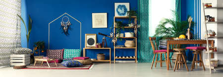
5. Contemporary Trends and Global Influences
Modern British homes are a fascinating blend of time-honoured tradition and ever-evolving global influences, particularly evident in their approach to colour. While British interiors have long been celebrated for their understated palettes and muted tones—think sage greens, duck egg blues, and classic greys—there is a visible shift towards bolder, more eclectic colour choices inspired by international trends. The embrace of deep jewel tones, sun-soaked Mediterranean hues, or even vibrant botanical prints has become increasingly common, reflecting a cosmopolitan outlook. Yet, what sets British homes apart is the way these contemporary elements are carefully layered upon a foundation of quintessentially British sensibilities. Homeowners might incorporate a Moroccan-inspired rug or Scandinavian pastel accents, but these are balanced with traditional architectural features like cornices, dado rails, and fireplaces, maintaining an unmistakable sense of place. This interplay between the old and new allows British interiors to feel both current and steeped in heritage. Furthermore, the rise of global travel and digital inspiration platforms has enabled a wider palette of colours and textures to enter the British home, yet they are always subtly reinterpreted to suit local tastes—tempered with a love for comfort, practicality, and that distinctive British understatement. Ultimately, this balancing act ensures that while British homes may borrow from the world’s colour stories, they never lose their unique identity rooted in history, culture, and a very particular kind of charm.
6. Colour in Social Spaces and Domestic Rituals
In the British home, communal areas such as the kitchen and sitting room serve as the heart of domestic life—sites where family and friends gather for cherished rituals. The use of colour in these spaces is more than mere decoration; it subtly orchestrates social interaction and sets the mood for time-honoured traditions.
The Kitchen: Warmth, Function, and Hospitality
The palette of a British kitchen often leans towards soft creams, heritage blues, or sage greens—shades that evoke both practicality and welcome. These hues create an inviting backdrop for everyday exchanges, whether it’s morning chats over a cuppa or bustling preparations for Sunday roasts. The choice of muted, earthy tones reflects a cultural preference for understated warmth, reinforcing the kitchen’s role as a space of comfort and nourishment.
The Sitting Room: Calm Sophistication
British sitting rooms traditionally favour deep greens, navy blues, or gentle greys, offering a sense of calm sophistication. These colours frame moments of relaxation—think afternoon tea with fine china on a rainy day—and invite lingering conversations by the fire. The carefully curated palette balances formality with cosiness, underscoring the value placed on refined yet approachable hospitality.
Facilitating Rituals Through Colour
Colour choices in these communal zones do more than please the eye; they actively support key British rituals. A softly painted kitchen enhances the conviviality of sharing a roast dinner around the table, while a richly hued sitting room encourages guests to settle in for tea and cake. The interplay between tradition and personal expression is visible in every brushstroke—each hue chosen not only for its aesthetic qualities but also for its ability to foster togetherness and uphold cultural identity within the home.
7. Conclusion: Colour as a Marker of British Home Identity
In synthesising the varied arguments presented, it becomes evident that colour is not merely an aesthetic decision but a profound marker of both individual expression and collective identity within British homes. The unique palette found across Britain—ranging from the muted, heritage-inspired tones of Victorian terraces to the playful pastels of seaside cottages—reflects a deep engagement with national history, regional character, and personal taste. At its core, colour in the British domestic context serves as a visual shorthand for values, aspirations, and even quiet acts of rebellion against fleeting trends. This layered approach to colour enables homeowners to reference tradition while simultaneously asserting their own narratives, creating spaces that are at once recognisably British yet distinctly personal. Thus, far from being static or prescriptive, the use of colour in British homes continues to evolve, absorbing influences from multicultural urban life as well as rural idylls. It remains an ever-present thread woven through the fabric of daily living—a subtle but powerful means by which Britons articulate who they are, where they come from, and how they wish to be seen within the broader tapestry of British society.