Introduction to Colour Psychology
Colour psychology is the study of how different hues influence human emotions and behaviours, playing a significant role in our daily experiences and environments. Within the context of interior design, understanding the psychological impact of colour is essential for creating spaces that are not only aesthetically pleasing but also evoke the desired mood and atmosphere. In British culture, where tradition meets contemporary trends, colour choices often reflect both personal taste and cultural values. From calming blues reminiscent of the British seaside to earthy greens inspired by lush countryside landscapes, each shade has the potential to shape how people feel within a space. By recognising these underlying principles, homeowners and designers across the UK can make informed decisions that enhance comfort, well-being, and functionality in their interiors.
2. The Historical Influence of British Culture on Colour Use
British culture has a rich and layered history, which has significantly shaped the nation’s approach to colour in interior design. From the grandeur of the Victorian era to the minimalist sensibilities of contemporary homes, the evolution of colour preferences reflects broader social, economic, and cultural shifts across Britain. Understanding these historical influences provides valuable insight into why certain palettes remain popular or are revived in British interiors today.
The Victorian Era: Opulence and Symbolism
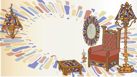
During the Victorian period (1837–1901), colour choices were often dictated by technological advancements in dye production, social status, and prevailing moral attitudes. Deep, saturated colours such as burgundy, forest green, and navy blue dominated parlours and drawing rooms, symbolising wealth and respectability. Ornate wallpapers with intricate patterns further accentuated these bold shades.
| Era | Typical Colours | Cultural Significance |
|---|---|---|
| Victorian | Burgundy, Forest Green, Navy Blue | Luxury, Status, Tradition |
| Edwardian | Pale Blues, Sage Greens, Creams | Elegance, Lightness, Social Change |
| Modern/Contemporary | Greys, Soft Whites, Pops of Bold Colour | Simplicity, Practicality, Individuality |
The Shift Towards Lighter Tones: Edwardian to Modern Times
The Edwardian era ushered in lighter and airier interiors as a reaction to the heaviness of Victorian décor. Pale blues, sage greens, and creams became fashionable, reflecting a desire for freshness and an increased emphasis on hygiene and light. This trend was further cemented post-war when practicality took precedence—greys and neutrals became staples due to their versatility and understated elegance.
Influence of Contemporary British Culture
Today’s British homes often blend heritage hues with modern accents. While muted tones like dove grey or soft white form the backdrop for many interiors—reflecting Britain’s often overcast skies—there is also a growing appreciation for statement colours used sparingly for impact. This blend of tradition and innovation is characteristic of British design sensibilities.
Summary Table: Evolution of Colour Preferences in British Homes
| Period | Main Influences | Common Colour Choices |
|---|---|---|
| Victorian Era | Industrial Revolution, Social Hierarchy | Burgundy, Dark Green, Gold Accents |
| Edwardian Era | Lifestyle Changes, Health Awareness | Pale Blue, Sage Green, Ivory White |
| Post-War Modernism | Austerity Measures, Modern Materials | Grey Tones, Beige Neutrals, Pastel Highlights |
| Contemporary Britain | Cultural Diversity, Global Trends | Dove Grey, Charcoal Black, Bright Accent Colours (e.g., Mustard Yellow) |
By recognising how historical events and societal changes have impacted colour psychology in British homes over time, homeowners and designers can make informed decisions that respect tradition while embracing contemporary style.
3. Popular Colour Palettes in British Interiors
When exploring the psychology of colour within British homes, it becomes clear that certain palettes have become quintessentially popular, reflecting both historical influences and contemporary sensibilities. Earthy tones—such as sage green, warm taupe, and clay brown—feature prominently throughout British interiors. These colours evoke a sense of calm, stability, and connection to the natural landscape, mirroring the country’s lush countryside and seasonal changes. Muted shades like dove grey, dusty blue, and soft blush are equally favoured. Their understated elegance aligns with the British appreciation for subtlety and restraint, setting a tranquil backdrop that accommodates both traditional and modern furnishings.
The popularity of these palettes is deeply rooted in cultural identity. The British tendency towards understatement is reflected in their avoidance of overly vibrant or garish hues; instead, there is a preference for colours that age gracefully and contribute to a cosy, inviting atmosphere. This careful curation not only draws from historical Georgian and Victorian influences—where paint pigments were often naturally derived—but also resonates with today’s sustainability values and the desire to bring the outdoors in. Ultimately, these colour choices speak volumes about British attitudes towards home life: comfort, heritage, and harmony remain at the heart of interior design decisions.
4. Regional Differences and Local Identity
Across the United Kingdom, regional diversity plays a significant role in shaping colour preferences within interior design. The distinctive histories, climates, and cultural heritages of England, Scotland, Wales, and Northern Ireland all contribute to unique approaches in the use of colour, reflecting both local pride and practical considerations.
Distinct Colour Palettes Across the UK
Each nation within the UK has developed its own palette influenced by landscape, tradition, and identity. For example, English interiors often favour muted tones inspired by countryside gardens and historic manor houses. In contrast, Scottish designs embrace deep greens, blues, and reds reminiscent of tartans and rugged Highland scenery. Welsh homes may reflect the dramatic coastlines and lush valleys with earthy hues and slate greys. Meanwhile, Northern Irish interiors frequently incorporate rich mossy greens and soft neutrals echoing their rolling fields and coastal vistas.
Regional Colour Influences Table
| Region | Typical Colour Schemes | Cultural Influences |
|---|---|---|
| England | Sage green, soft beige, pastel blue | Victorian heritage, countryside gardens |
| Scotland | Deep green, heather purple, crimson red | Tartan patterns, Highland landscapes |
| Wales | Slate grey, fern green, warm terracotta | Natural stonework, Celtic mythology |
| Northern Ireland | Moss green, creamy white, stormy blue | Lush countryside, coastal climate |
Celebrating Local Identity Through Colour Choices
The deliberate selection of colours rooted in regional identity not only enhances aesthetic appeal but also fosters a sense of belonging and heritage. British homeowners often choose palettes that pay homage to their local environment or ancestral roots. This practice is evident in everything from period property renovations to new builds seeking an authentic sense of place.
In summary, understanding these regional distinctions enables more thoughtful interior design decisions that respect both the psychology of colour and the rich tapestry of British culture.
5. Modern British Trends and Sustainability Concerns
In recent years, the British approach to interior design has undergone a significant transformation, driven by a collective commitment to sustainability and environmental consciousness. This shift is not merely about aesthetic preferences, but also reflects the wider societal values and cultural narratives emerging across the UK. Eco-friendly choices are no longer confined to niche markets; they have become a mainstream priority for homeowners, designers, and architects alike.
Embracing Sustainable Materials
The demand for sustainable materials has soared, with reclaimed wood, recycled metals, and ethically sourced textiles featuring prominently in British homes. These choices are often motivated by a desire to reduce environmental impact while retaining the distinctive charm of British interiors. Natural finishes, such as lime plaster or clay-based paints, have grown in popularity due to their low VOC emissions and inherent connection to Britain’s rural heritage.
Eco-Friendly Colour Palettes
Colour psychology plays a pivotal role in these trends. Earthy greens, soft blues, and warm neutrals are increasingly favoured for their calming effects and their association with nature. Many British brands now offer eco-conscious paint options, utilising plant-based pigments and biodegradable packaging to appeal to environmentally aware consumers. The use of these hues not only supports wellbeing but also signals a mindful response to contemporary sustainability concerns.
The Influence of Local Culture
Britain’s growing environmental awareness can be seen in the preference for local craftmanship and traditional methods that minimise carbon footprints. Designers often opt for locally produced furnishings or vintage pieces, both as a nod to British heritage and as a practical measure against waste. This fusion of tradition with modern ecological responsibility typifies the evolving identity of British interiors—where colour psychology is harnessed not just for visual appeal, but as an expression of ethical values and cultural progress.
6. Practical Tips for Applying Colour Psychology in British Homes
Applying colour psychology within the context of British culture can make your home not only visually pleasing but also emotionally resonant. Here are some hands-on tips for homeowners and designers looking to weave culturally relevant colour choices into their interiors:
Consider the Role of Light
British weather is famously unpredictable, often grey and cloudy. When selecting colours, account for natural light levels—soft neutrals like off-white or pastel shades can brighten dim spaces, while deeper tones add warmth and cosiness in larger rooms.
Reflect Local Heritage
Draw inspiration from local history and landscapes. Earthy greens, slate blues, and muted reds echo the rolling countryside, historic brickwork, and traditional gardens found across the UK. These hues foster a sense of familiarity and connection to place.
Use Colour to Define Purpose
Assign colours based on function—calming blues and greens for restful bedrooms, energising yellows or rich terracottas for sociable kitchens and living areas. This aligns with British tendencies toward practical, purposeful design that enhances wellbeing.
Embrace Tradition with Modern Flair
Don’t be afraid to blend classic British palettes—like deep navy or forest green—with contemporary accents such as blush pinks or metallics. This approach respects tradition while keeping interiors fresh and inviting.
Balance Boldness with Restraint
The British preference leans towards understated elegance. Limit bold colours to accent walls, soft furnishings, or artwork rather than overwhelming entire rooms. This creates visual interest without sacrificing comfort or sophistication.
Personalise Through Accessories
If you’re hesitant about permanent colour changes, introduce culturally meaningful shades through cushions, throws, rugs, or lampshades. This allows easy updates while reflecting personal style within a broader British context.
By thoughtfully integrating these principles, you’ll create interiors that are both attuned to the nuances of British culture and supportive of the psychological needs of those who live there.